Workflows, measured examples and research to help you interpret a predicted heatmap and decide what to test next. 27 guides, written by the Heatpoints team, each with its sources and its limits.
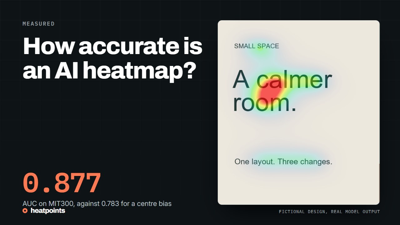
The model behind Heatpoints has a public benchmark score. Here is what it measures, how it compares with the leading model and a centre bias, and why none of it is a percentage of visitors.
Accuracy is measured against recorded fixations; What the benchmark reports for UNISAL; How to read the gap; and more
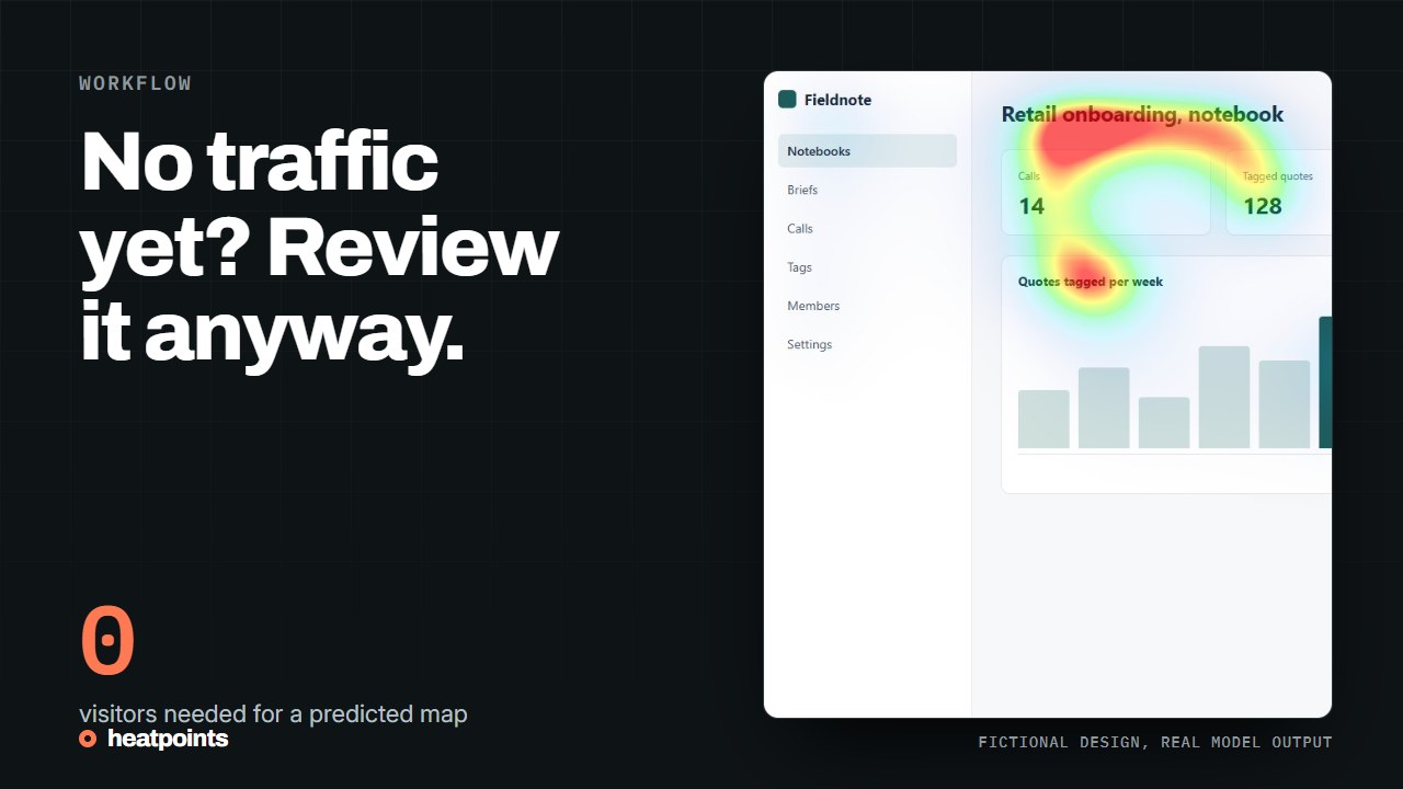
A page on staging has no visitors, so behavioural heatmaps have nothing to show. A predicted attention map works from a screenshot or a live tab, including behind a login. Here is the workflow, with a real example.
Why behavioural tools go quiet before launch; Three ways to get an image of an unlaunched page; A worked example: one page, five positions; and more
Several heatmap tools have a free tier, and they do not measure the same thing. Here is what each one offers, checked on its own pricing page, and which question it answers.
Two families, two questions; Microsoft Clarity; Plerdy; and more
The model behind Heatpoints has a public benchmark score. Here is what it measures, how it compares with the leading model and a centre bias, and why none of it is a percentage of visitors.
Accuracy is measured against recorded fixations; What the benchmark reports for UNISAL; How to read the gap; and more
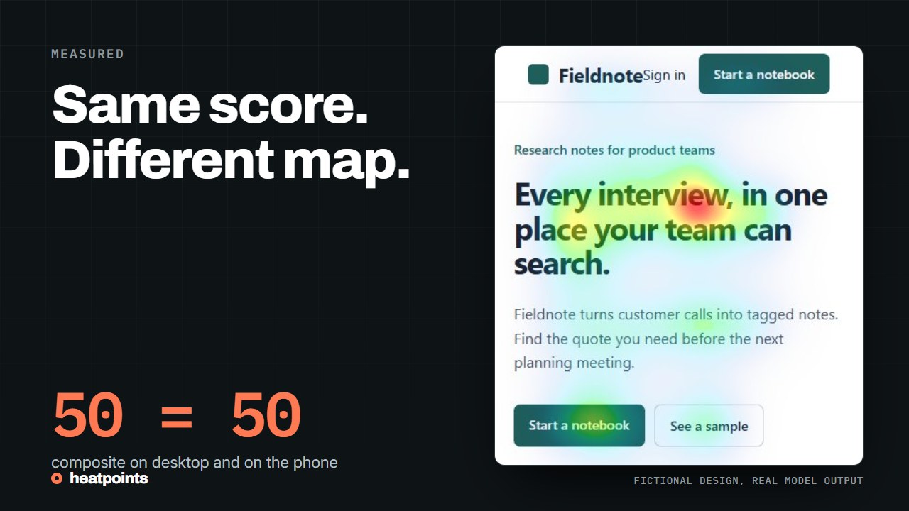
We captured one fictional landing page at 1280 px and at 390 px and ran both through the model. The composite score is identical. The maps are not, and the grid shows why.
One page, two captures; Same score, different story; What the grid shows; and more
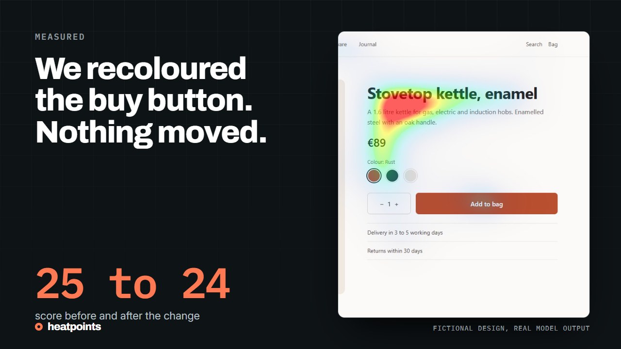
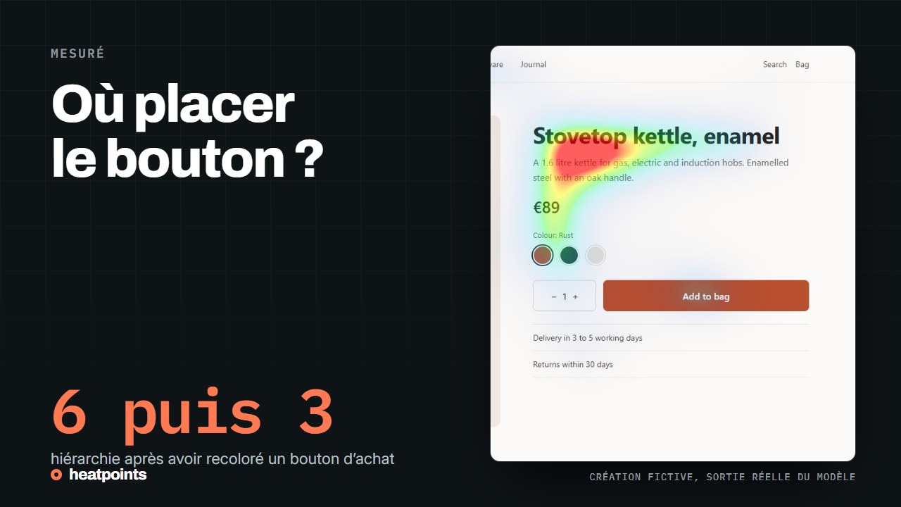
On a fictional product page, turning the add-to-bag button into the product colour barely moved the predicted map. The title and description kept the strongest region, and the product photo stayed cool both times. Three one-change experiments, compared.
The two versions; What the model reported; Three one-change experiments side by side; and more
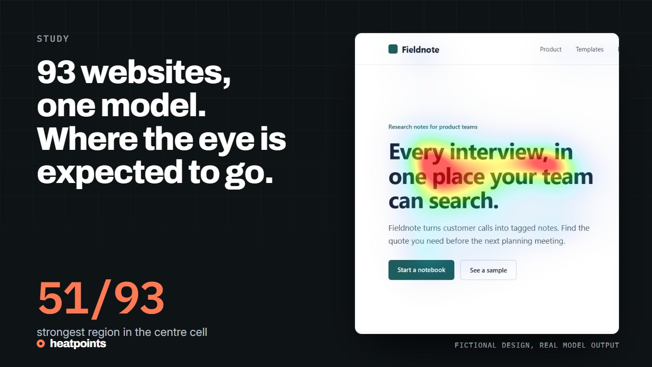
We ran the same model on 93 captures of public websites. The strongest region sat in the centre row on most of them, and no capture scored 80 or more. What that means for a hero section, and what it does not.
What the dataset is; Where the strongest region fell; How the scores were distributed; and more
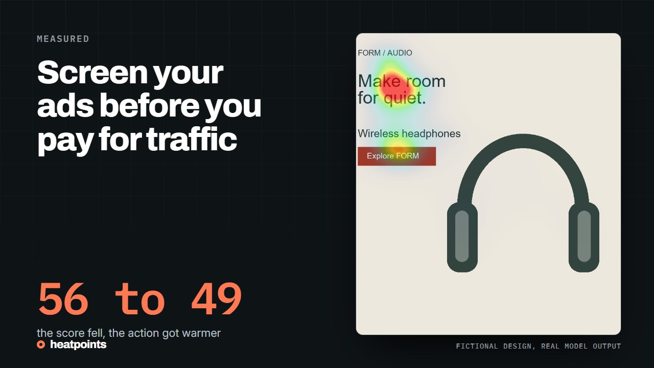
An attention review cannot forecast ad results, but it can catch weak variants before they use budget. A practical workflow from brief to live experiment.
Two different kinds of evidence; Start with a hypothesis, not a pile of creatives; Screen the variants; and more
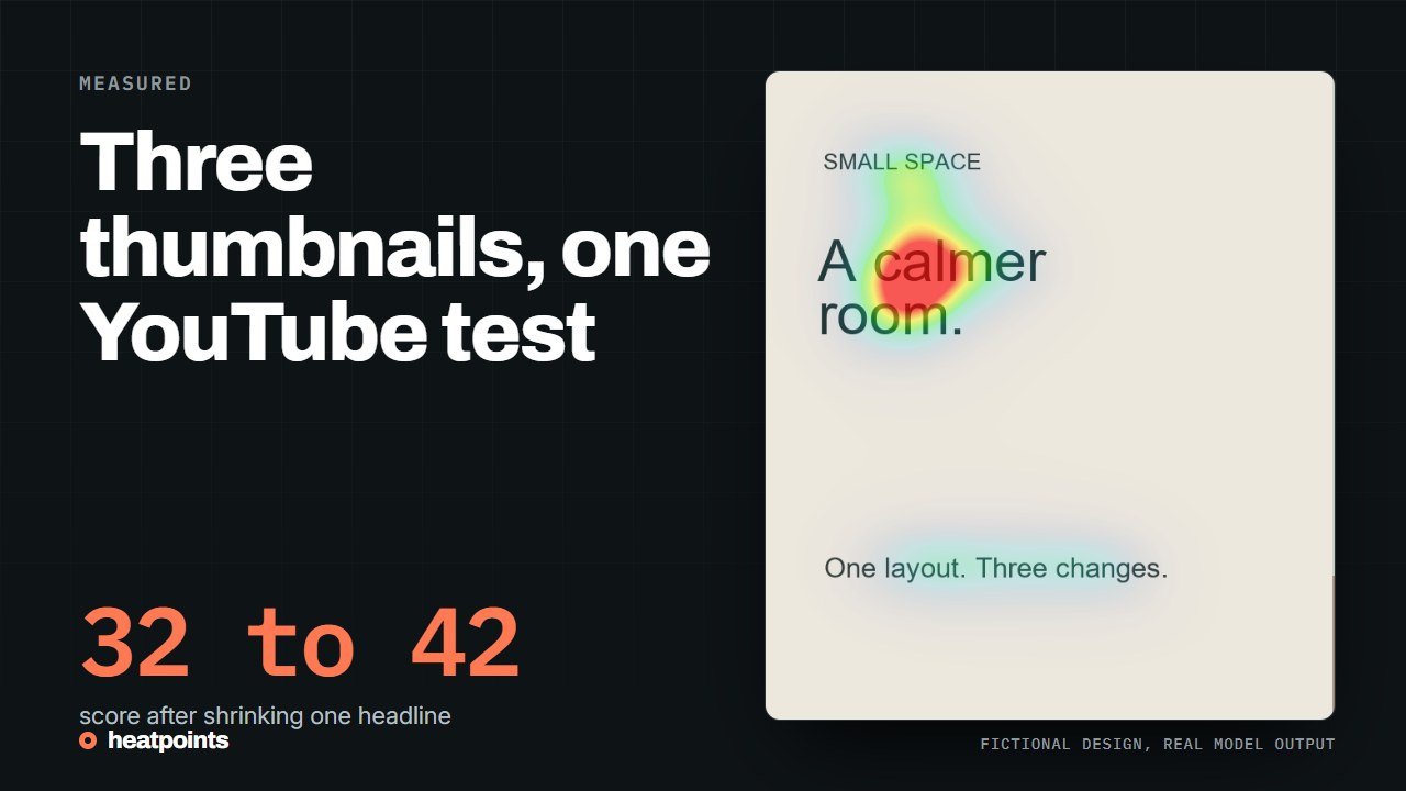
YouTube can test up to three thumbnails against each other. Use an attention review to make each variant a distinct, deliberate option before viewers decide.
What YouTube's test actually measures; Why variants deserve preparation; Build three distinct options; and more
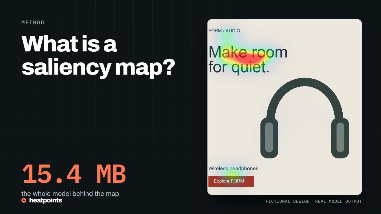
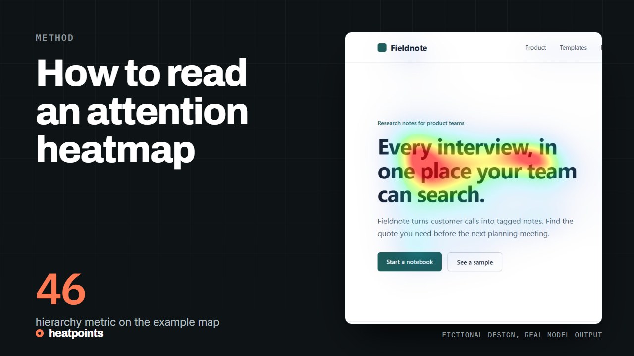
A saliency map estimates which regions of an image are likely to draw the eye. Learn where the idea comes from, how models are evaluated and what the map cannot tell you.
A map of likely visual attention; Where the idea comes from; How saliency models are evaluated; and more
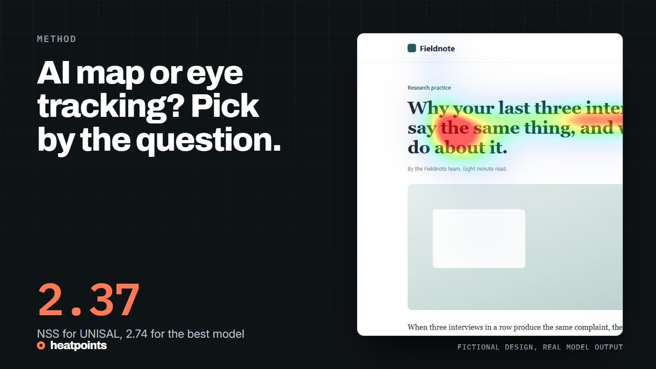
AI predicts visual saliency from pixels. Eye tracking measures gaze from participants. Choose between them by the decision you need to make, not by the colour of the map.
Prediction and measurement are different evidence; Use prediction when you need a design hypothesis; Use participants when the task changes the question; and more
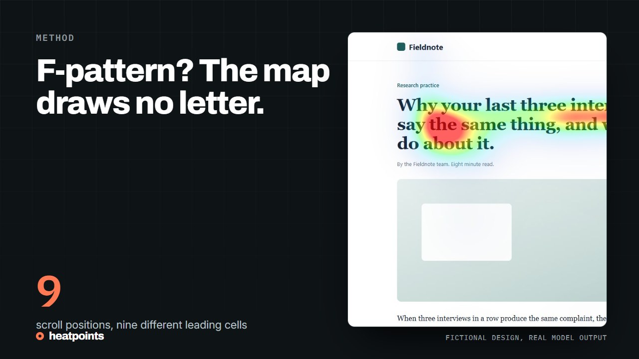
Reading patterns can inform a layout review, but they cannot prescribe the path every visitor follows. Learn what a static heatmap can and cannot show.
What the F-pattern describes; Treat the Z as a composition sketch; A heatmap does not contain an ordered path; and more
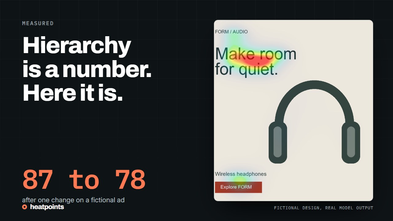
Check whether the headline, product and main action have a clear relationship. A practical review using a screenshot, an attention prediction and a controlled revision.
Start with the message, not the score; Review the page in its actual format; Change one relationship at a time; and more
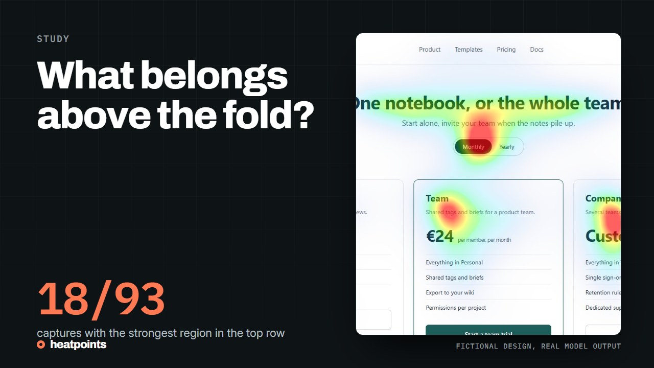
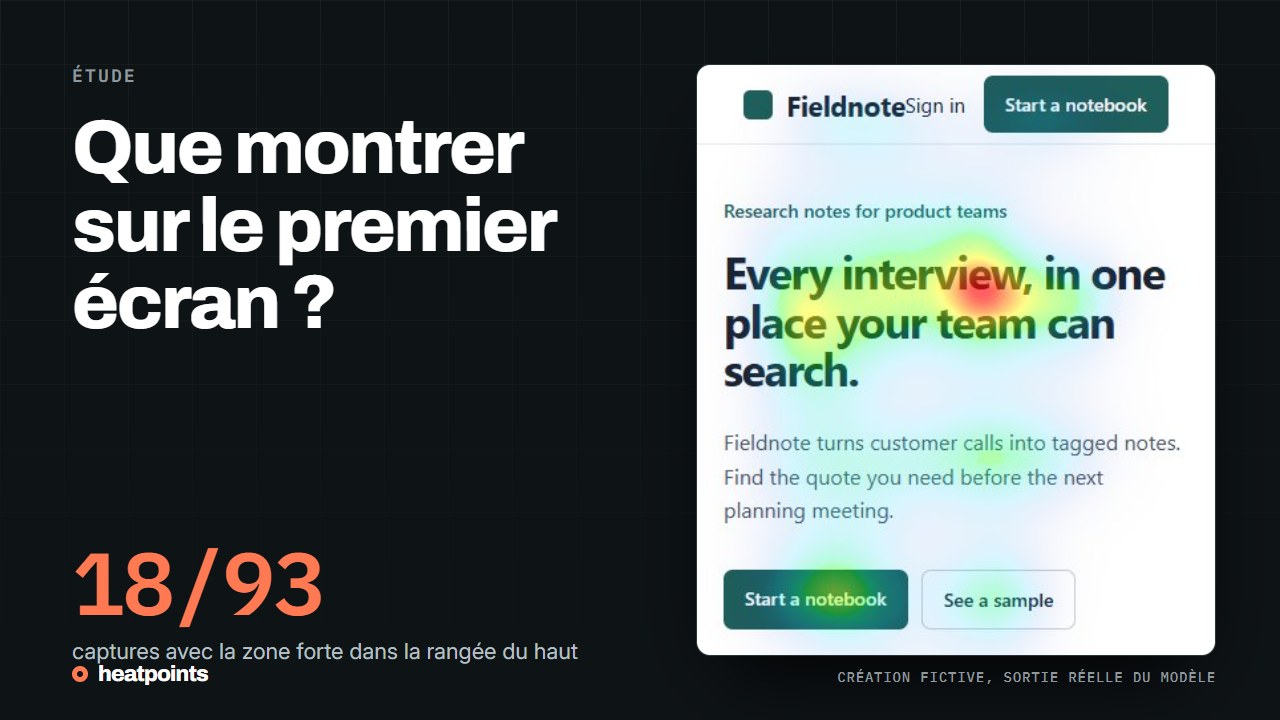
The fold is the visible edge of a viewport, not a universal pixel height. Design the first screen to explain the page and make the next step discoverable.
Define the viewport before judging the fold; People scroll, but exposure is not equal; Review a first screen in three passes; and more
Place the action where its purpose is clear and the reader has enough information to decide. Use an attention map to review visibility, then test the actual task.
There is no universally best coordinate; Review a concrete purchase decision; Compare placement without changing everything; and more
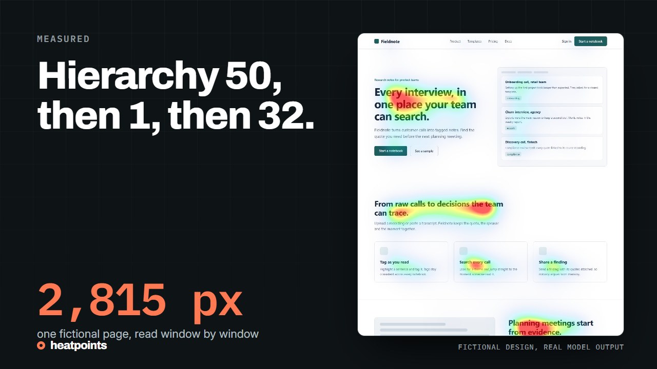
A useful long page answers the reader's next question as they move down. Review its sequence, visual transitions and actions without inventing a visitor path.
Give each section a job; Audit the page screen by screen; Look for gaps rather than adding length; and more
A page on staging has no visitors, so behavioural heatmaps have nothing to show. A predicted attention map works from a screenshot or a live tab, including behind a login. Here is the workflow, with a real example.
Why behavioural tools go quiet before launch; Three ways to get an image of an unlaunched page; A worked example: one page, five positions; and more
Several heatmap tools have a free tier, and they do not measure the same thing. Here is what each one offers, checked on its own pricing page, and which question it answers.
Two families, two questions; Microsoft Clarity; Plerdy; and more
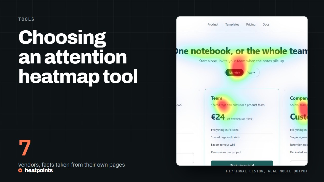
Compare image review, browser capture, design integration and team workflows. A practical shortlist with official sources, without an invented accuracy league table.
Separate predictive tools from behavioural heatmaps; Shortlist by the work you need to do; Use the same test images; and more
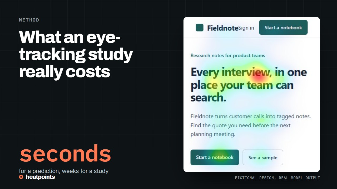
Recruitment, study design, equipment and analysis shape the budget. Compare those deliverables with an AI heatmap without treating the two methods as interchangeable.
Start with the research question; Ask for an itemised proposal; What an AI prediction changes; and more
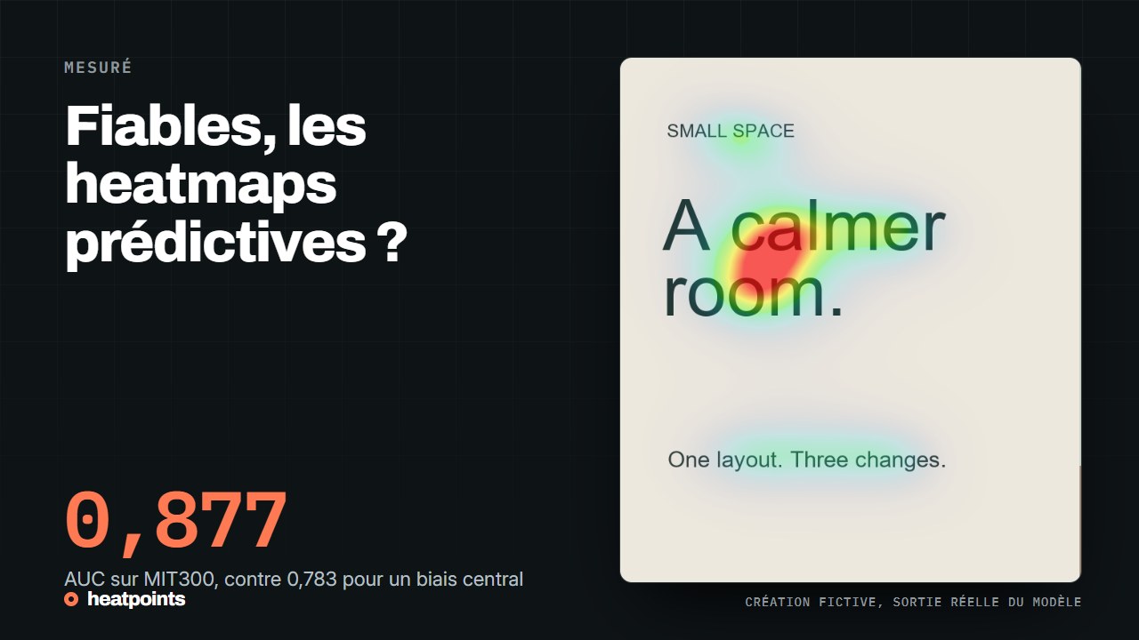
Le modèle derrière Heatpoints a un score public sur un benchmark de référence. Voici ce qu'il mesure, comment il se situe face au meilleur modèle et à un simple biais central, et pourquoi ce n'est pas un pourcentage de visiteurs.
La fiabilité se mesure face à des fixations enregistrées ; Ce que le benchmark indique pour UNISAL ; Comment lire l'écart ; et plus
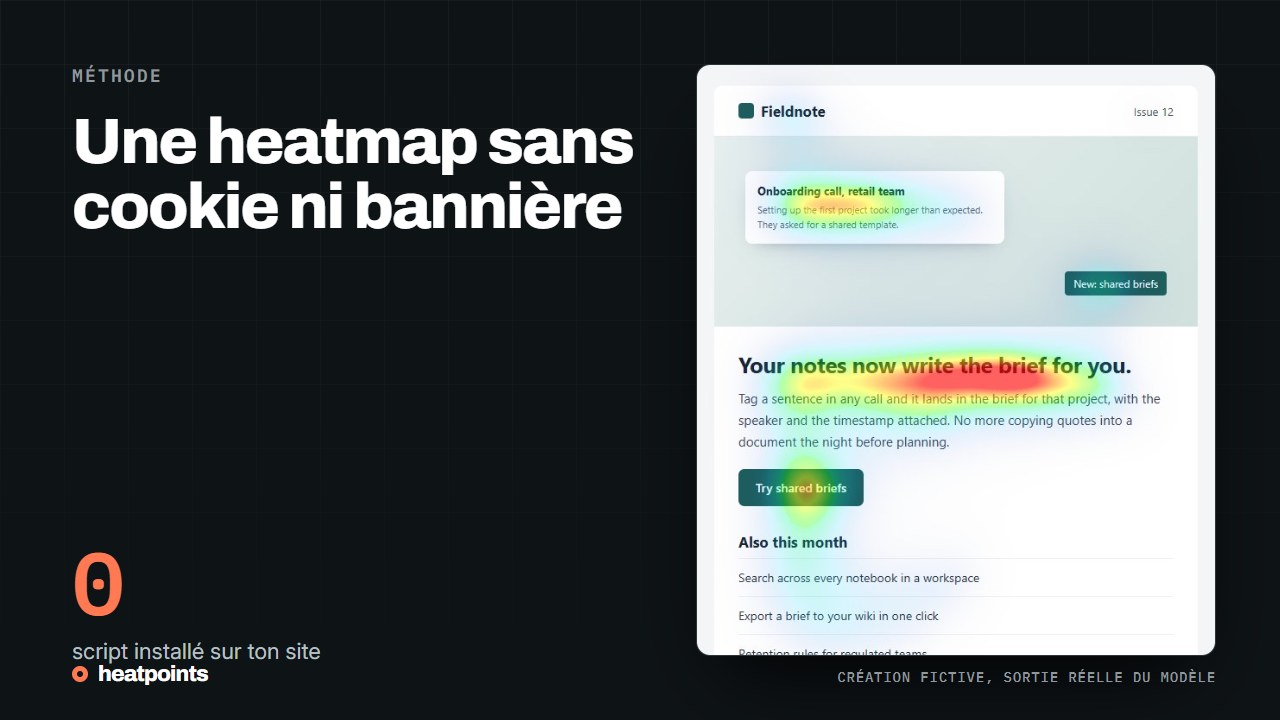
Une heatmap comportementale enregistre des visiteurs, donc elle pose la question du consentement. Une heatmap prédite ne fait tourner aucun script sur ton site. Ce que cela règle, ce que cela ne règle pas, et comment combiner les deux.
Pourquoi les heatmaps classiques posent la question du consentement ; Ce qu'une heatmap prédite ne fait pas ; Ce qui est quand même traité ; et plus
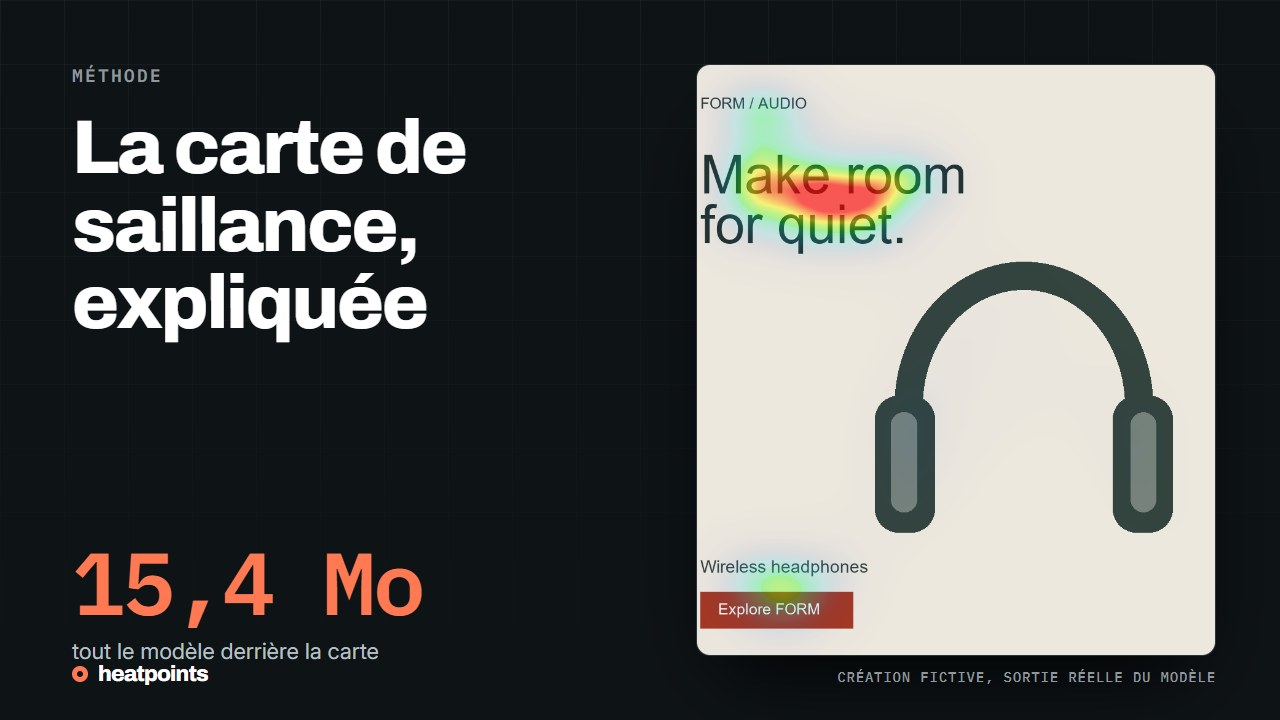
Une carte de saillance estime les zones d’une image qui attirent le regard. D’où vient l’idée, comment les modèles sont évalués et ce que la carte ne dit pas.
Une prédiction, pas une mesure ; D’où vient l’idée ; Comment on évalue un modèle ; et plus
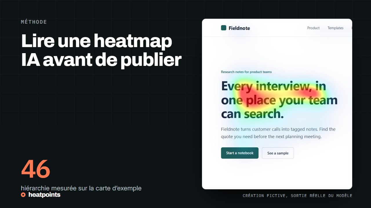
Une heatmap IA prédit la saillance d’une image. Voici comment l’utiliser sur une maquette, une publicité ou une page web, sans la confondre avec des clics mesurés.
Ce que la carte représente ; Une méthode de relecture concrète ; Exemple et interprétation ; et plus
La ligne de flottaison dépend de la fenêtre, de l’appareil et du contenu. Construis un premier écran clair, puis donne une raison utile de poursuivre la lecture.
Une limite d’écran, pas une hauteur universelle ; Les visiteurs peuvent défiler ; Relire le premier écran ; et plus
Le bon emplacement dépend de la décision demandée. Examine le contexte, la visibilité et le libellé du bouton avant de tester son effet sur les conversions.
Placer l’action dans son contexte ; Vérifier la concurrence visuelle ; Comparer deux placements proprement ; et plus