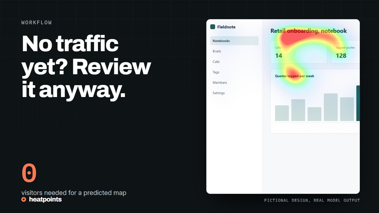
Why behavioural tools go quiet before launch
Click maps and scroll maps aggregate what visitors did. Before launch there are no visitors, and on a staging server there are usually no tracking scripts either. Many teams also cannot add a script to a client's site, or do not want a tracker on a page that has not been reviewed for consent yet. Even after launch, a low-traffic page can take weeks to produce a readable click map.
None of that stops a review of the visual hierarchy. The page exists as pixels, and a saliency model only needs pixels. The review is not a substitute for behaviour; it is what you can do in the weeks when there is no behaviour to look at.
Three ways to get an image of an unlaunched page
The table compares the three inputs Heatpoints accepts today. Each gives a map of the same kind; they differ in what you need to prepare and in what the capture includes.
| Input | What you need | What the capture includes | Best for |
|---|---|---|---|
| Screenshot of the first screen | The page in a browser at the width people will use | Exactly what fits in one viewport, browser chrome excluded | Staging pages, client sites, quick checks |
| Exported design frame | A frame exported as PNG or JPG with final text and background | The design as drawn, before the code exists | Pre-development review of a mockup |
| Chrome extension on the live tab | The page open in Chrome, extension activated | The visible part of the tab, refreshed as you scroll or resize | Pages behind a login, long pages, review while editing |
References: The Chrome extension · Analyse an exported Figma frame · The image tool
A worked example: one page, five positions
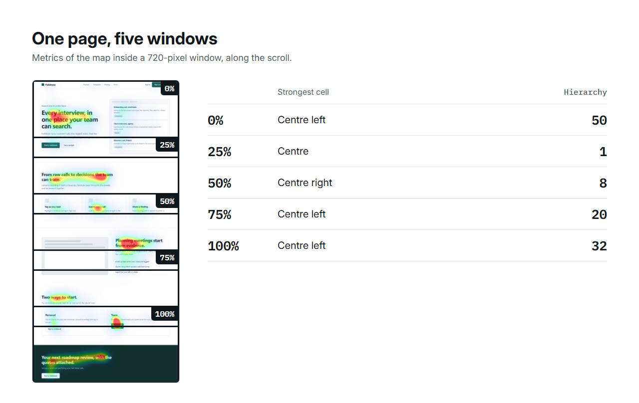
The fictional Fieldnote landing page on this site is 2,815 pixels tall at a desktop width. Its whole-page map was computed once, and the metrics were then read inside a 720-pixel window at forty positions, which is what the extension shows you as you scroll. The table gives five of those positions. The hierarchy metric, the contrast between the strongest cell and the next, swings from 50 at the top to 1 in the middle of the page and back to 32 at the bottom.
That swing is the finding. At the top, the headline clearly leads. A quarter of the way down, the three feature cards share the emphasis equally, so nothing leads. At the bottom, the closing headline leads again. A screenshot of the first screen would have shown only the first row of this table, which is why a scroll review matters on a long page.
| Scroll position | Attention | Focus | Hierarchy | Coverage | Strongest cell |
|---|---|---|---|---|---|
| Top of page | 9 | 68 | 50 | 8% | Centre left |
| 25% down | 10 | 73 | 1 | 11% | Centre |
| 50% down | 9 | 71 | 8 | 10% | Centre right |
| 75% down | 6 | 57 | 20 | 6% | Centre left |
| Bottom | 8 | 72 | 32 | 9% | Centre left |
References: Provenance of the page and its map · Readout of all forty positions
What to look for on a first review
Whether the headline is among the strong regions. Whether the main action sits in or next to one. Whether a decorative element, a large illustration or a busy background takes the emphasis instead. Whether the sections further down have a leading element at all, or whether they flatten into equal blocks as the feature cards did above. Those are visibility observations you can act on before anyone has seen the page.
- Capture the first screen at a realistic width, 1280 px for desktop or 390 px for a phone.
- Keep the final copy in the image. Placeholder text changes the map.
- Write down what should stand out before you run the image.
- Run it, then name the elements under the strongest regions.
- On a long page, scroll through with the extension and note where the hierarchy metric drops near zero.
Then compare a revision
Change one thing, run the new screenshot with the same settings and compare the two maps side by side. Championship ranks several variants with the same model and shows the underlying metrics, so a difference in score can be traced to a difference in the map. Keep the copy identical between variants so the difference comes from layout alone.
Two experiments on this site show what to expect. On a fictional ad, moving the product name and action up next to the product changed the ranking. On a fictional product page, recolouring the buy button changed almost nothing. Both results are useful; the second one saved a round of design work.
References: Compare variants · The product page experiment
What still needs real visitors
A predicted map does not measure reading order, comprehension, trust or clicks. Once the page is live, a behavioural tool or an experiment answers those questions, and the behavioural tools with a free tier are listed in the guide on free heatmap tools. The prediction is for the weeks before that, when there is nothing else to look at.
References: Free heatmap tools