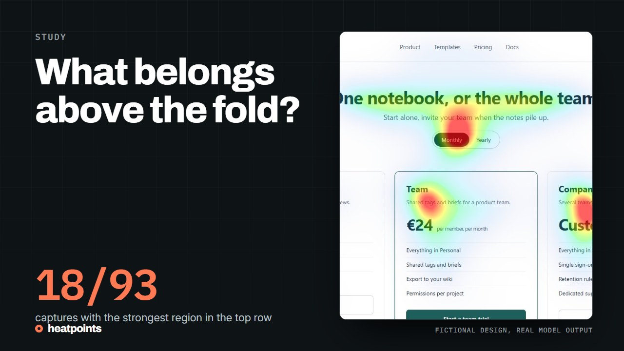
Define the viewport before judging the fold
A browser window, a mobile address bar, zoom and font wrapping all change what appears before scrolling. A desktop screenshot cannot establish what a mobile visitor sees. Start with representative widths and actual content rather than an abstract fold line.
The first screen should orient a visitor: what this page offers, who it is for and what to do next. It does not have to contain every feature, answer and testimonial. Packing everything into that space can weaken the hierarchy you wanted to improve.
People scroll, but exposure is not equal
NN/g's scrolling research observes how attention was distributed in its studies. It supports reviewing both the first screen and the rest of a page. It does not establish that every page today has the same percentage of attention above the fold.
References: NN/g: Scrolling and Attention
Review a first screen in three passes
First read the original screenshot. Then inspect an attention prediction. Finally return to the page and try the intended action. Each pass answers a different question.
- Can a new visitor explain the offer without scrolling?
- Are important words readable, and does the primary action have an understandable label?
- Does the predicted map emphasise meaningful elements or mostly decoration?
- Is there a reason to continue, with content visible or clearly suggested below?
- Does the mobile layout preserve that relationship without hiding essential controls?
The same first screen at two widths
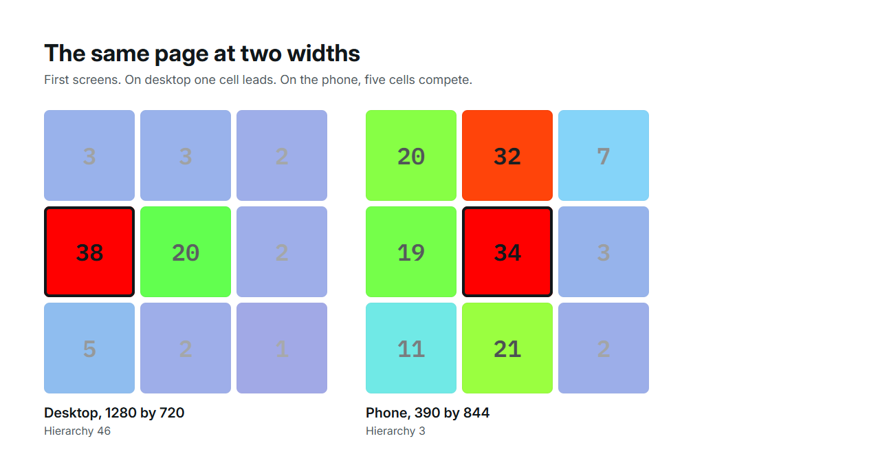
The fictional Fieldnote landing page was captured at 1280 px and at 390 px and both first screens were run through the model. The composite score is identical, 50, and everything underneath differs. On desktop the headline leads with a hierarchy metric of 46. On the phone, the headline and the first content card share the screen, hierarchy falls to 3 and coverage rises from 8 to 20 percent. A fold review on the desktop capture alone would have missed the phone's competing card.
| Render | Composite | Attention | Focus | Hierarchy | Coverage | Strongest cell |
|---|---|---|---|---|---|---|
| Desktop, 1280 by 720 | 50 | 9 | 70 | 46 | 8% | Centre left |
| Phone, 390 by 844 | 50 | 17 | 84 | 3 | 20% | Centre |
References: Provenance, hashes and metrics · The full mobile and desktop comparison
What 93 captures say about the top third
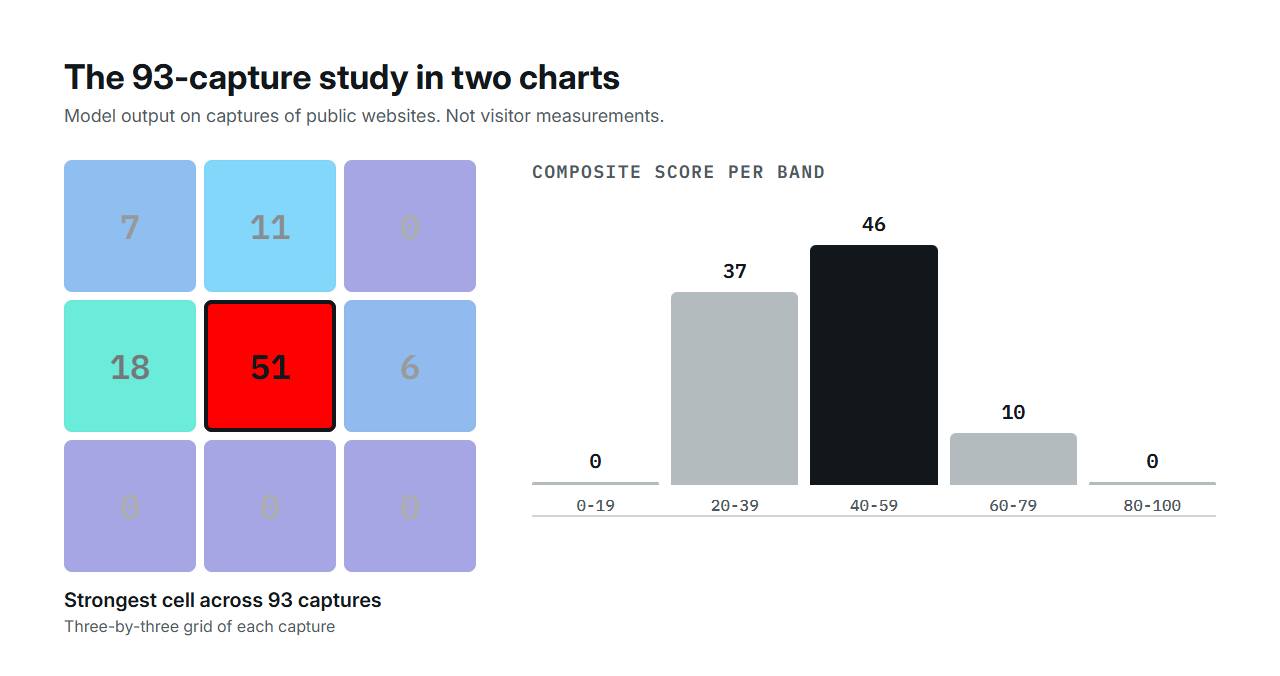
In the published study of 93 website captures, the strongest grid cell was in the top row on only 18 captures. On 51 it was the centre cell. That is a fact about captured pixels, which include navigation, banners and the browser's own chrome, and it says nothing about how many visitors scrolled. It is a reason to check where your own first screen's emphasis actually falls, not a target.
| Dominant cell | Captures |
|---|---|
| Centre | 51 |
| Centre left | 18 |
| Top centre | 11 |
| Top left | 7 |
| Centre right | 6 |
| Top right, bottom row | 0 |
References: The 93-capture study · Hero sections on 93 real websites
Avoid confusing the top third with the hero
Heatpoints summarises maps using a three-by-three grid. A dominant zone outside the top row is outside the top third of the captured image. It is not necessarily below the fold or outside the hero component.
The published site study uses this geometric definition. It cannot identify a hero's DOM boundaries, and it does not measure how many people scroll. Keep that distinction when citing the study or reading your own results.
References: Study methodology and corrected interpretation