
There is no universally best coordinate
A call to action belongs in the decision it supports. A familiar product with a simple offer may need an early action. A complex service may need evidence, eligibility details or a price explanation before a commitment makes sense.
Treat position as one part of the interface. The label, surrounding information and destination matter as much as whether the button stands out. ‘Get started’ can be visible while leaving people unsure whether they will pay, book a call or create an account.
Review a concrete purchase decision
For a product page, identify the information someone needs before buying: the item, price, relevant options and delivery constraints. Keep the action connected to those details. For a demo request, explain what happens after submission and what information is required.
A heatmap can flag visual competition between the action and nearby decoration. It cannot tell whether the buyer trusts the offer or has understood the terms. A warm button is therefore a visibility observation, not proof that the CTA works.
Compare placement without changing everything
Create two versions at the same viewport and keep the offer and button label constant. Change the position or surrounding spacing, then compare the images. Record whether the predicted emphasis moves toward the action or a competing element.
- Capture the original viewport with the CTA visible.
- Make one placement or spacing change.
- Analyse both screenshots in Championship.
- Inspect the CTA region in each overlay, not only the ranking.
- Test whether real users can explain and complete the next step.
References: Compare CTA variants
Two experiments on the action, measured
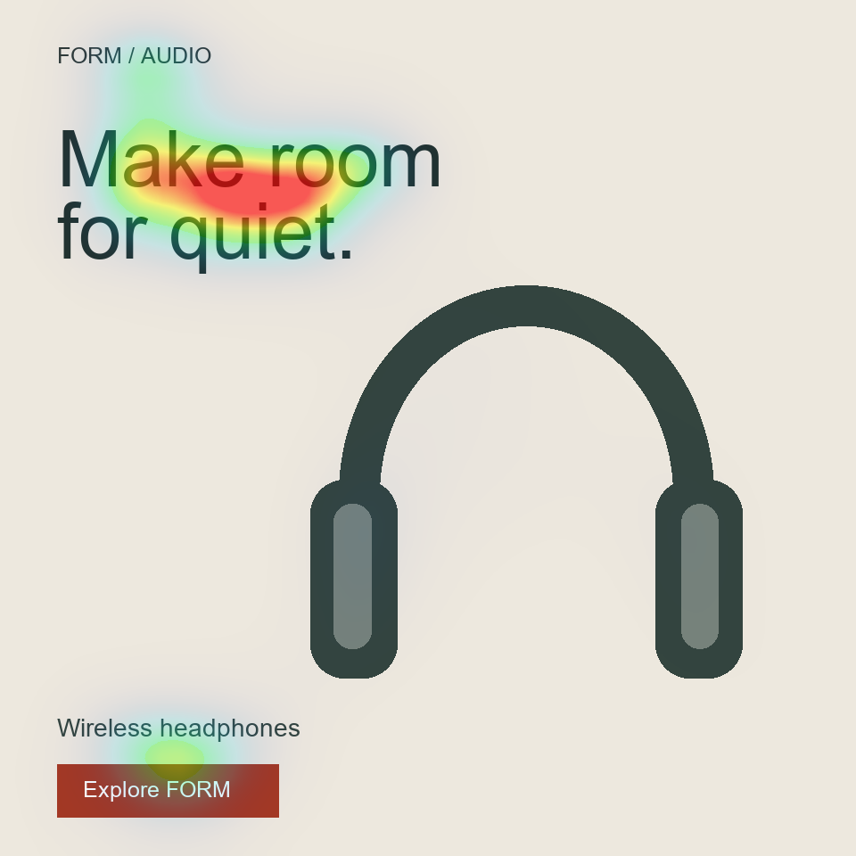
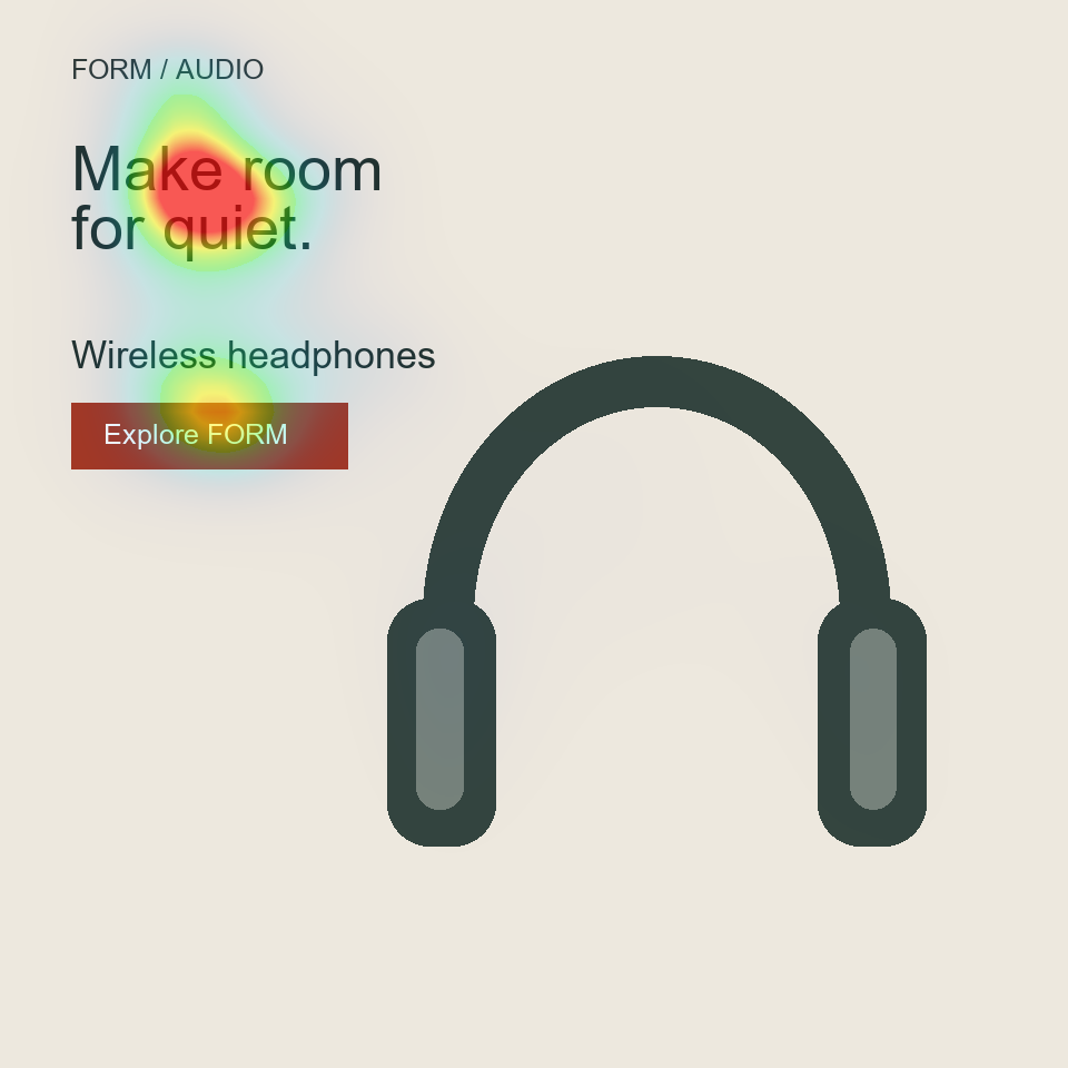
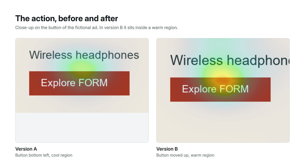
Two fictional designs on this site had their call to action changed, one variable at a time. On the product page, the add-to-bag button took the product colour: the map barely moved, the score went from 25 to 24, and the button showed no warm region in either version. On the square ad, the action and the product name moved up next to the product: the action entered a warm region while the composite fell from 56 to 49, because the headline no longer dominated as absolutely.
Colour did nothing. Position did something, and the score went the opposite way from the intent. Both are useful results: the first saved a round of design, the second shows why the score is read after the map.
| Design | The one change | Score A | Score B | Did the action enter a warm region? |
|---|---|---|---|---|
| Product page | Button in the product colour | 25 | 24 | No, in neither version |
| Square ad | Action and product name moved up next to the product | 56 | 49 | Yes, in version B |
References: Provenance, hashes and metrics · Provenance of the ad and thumbnail experiments
A placement review in five steps
The steps below keep the comparison honest: one variable, same width, same copy, and the map read before the score.
- Capture the screen at the width your visitors use, with the final label on the button.
- Write down what the reader needs to know before acting, and check it sits near the button.
- Run the capture and note whether the button is in or next to a strong region.
- Move the button, or change its surroundings, and export a second capture with everything else unchanged.
- Compare both maps in Championship; if the action entered a warm region, that is the observation to keep, whatever the score did.
References: Compare variants
Long pages and mobile screens
A long page can offer another action after a useful explanation, but repetition should serve a new decision point. A sticky action also takes space and can obscure content, particularly on mobile. Test the actual layout, including menus, keyboards and notices.
Review the first screen and later sections separately. Research on scrolling is evidence about studied behaviour, not a rule that every CTA must sit above a fixed pixel line.
References: NN/g: Scrolling and Attention