Give each section a job
A scroll journey is the sequence of information available as someone moves through a page. For a product, that could mean understanding the offer, seeing how it works, checking a relevant use case, resolving an objection and choosing a next step.
This is a design hypothesis, not a promise that everyone reads linearly. Some people go directly to pricing; others arrive on a deep link. Section headings and navigation should make those routes usable too.
Audit the page screen by screen
Use the Chrome extension to review the visible page as you scroll. Pause between sections to allow a new prediction. Record what question each screen answers and whether a visually strong element supports that answer.
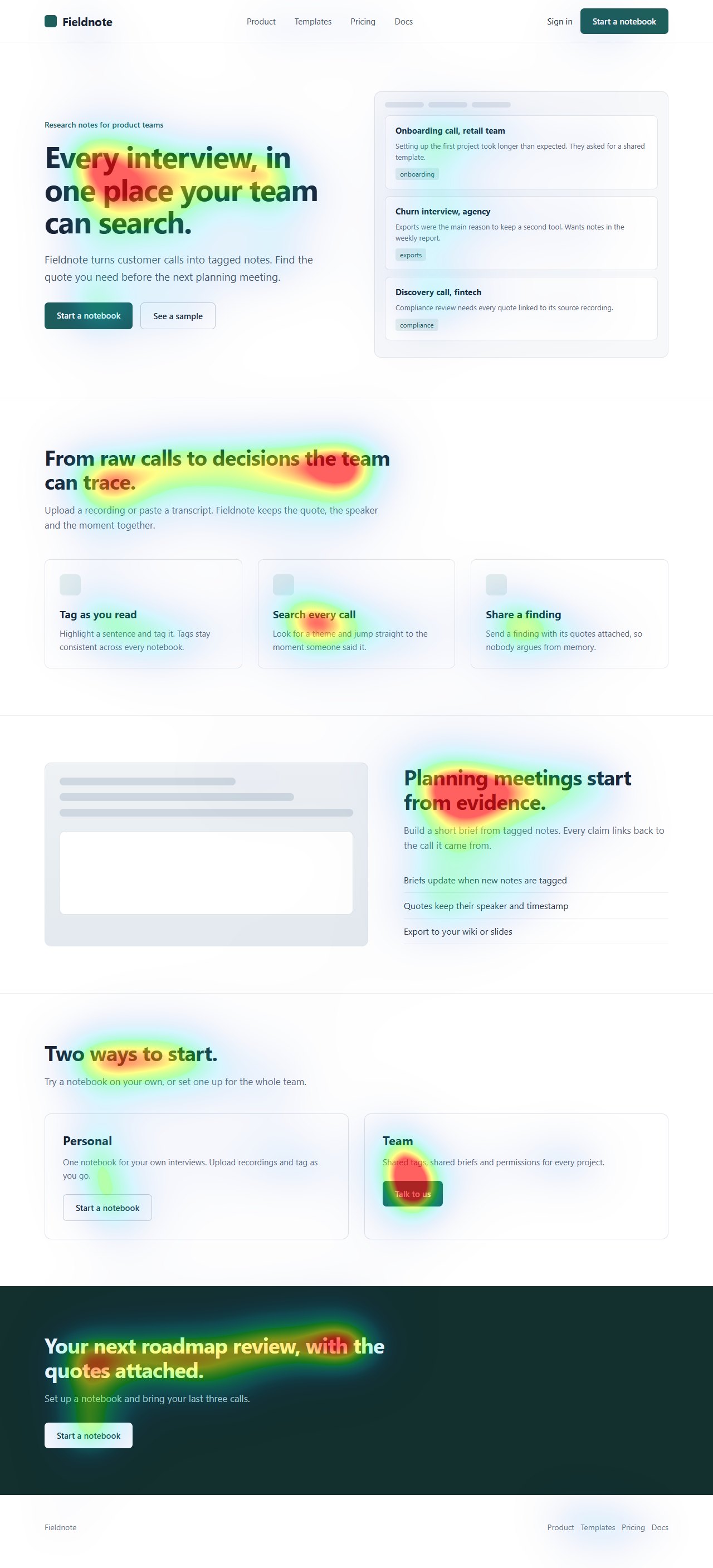
A full-page image is useful for checking overall composition, but it is not the same view a person sees through a browser window. Do not infer scroll reach from the attention colours on a tall export.
References: Chrome extension workflow
Look for gaps rather than adding length
A section that repeats the hero's promise without adding proof or detail is unlikely to answer a new question. Replace it with something concrete: a product example, a limitation, a workflow, or the conditions under which a feature is useful.
Check the transitions. After a demonstration, the reader may need to understand access limits. After a comparison, they may need a way to try the relevant feature. A useful next link is more valuable than a generic action repeated after every paragraph.
Validate the journey with actual behaviour
Predicted attention cannot measure how many visitors reach a section or why they leave. Use consent-appropriate behavioural analytics and user research when those are the questions. Check the first screen and later content without assuming a universal attention percentage.
References: NN/g: Scrolling and Attention
A scroll review, measured
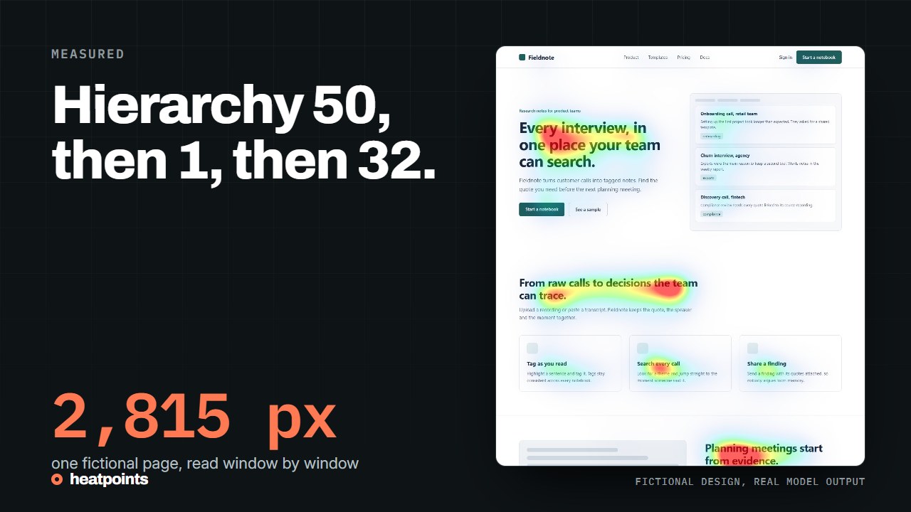
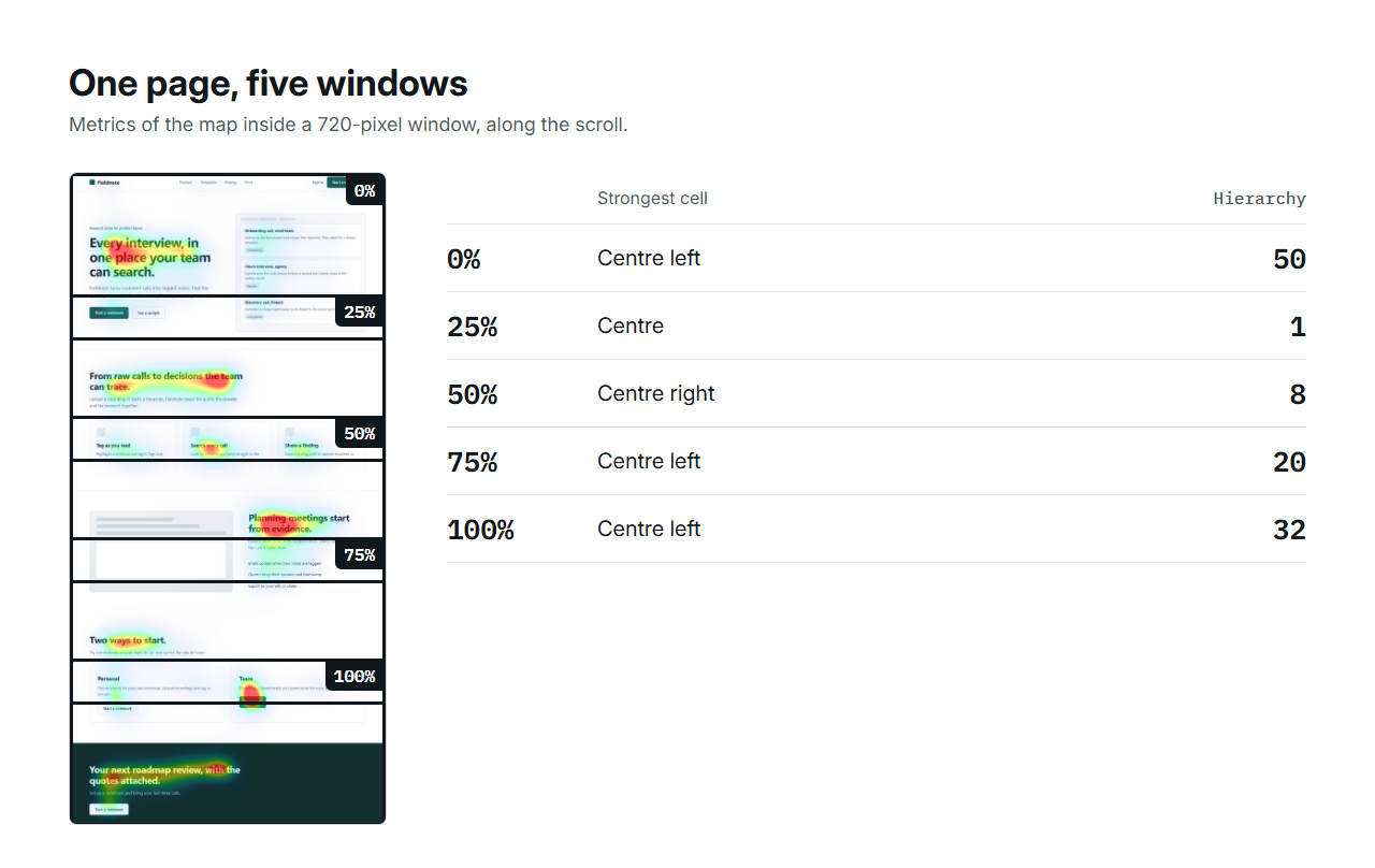
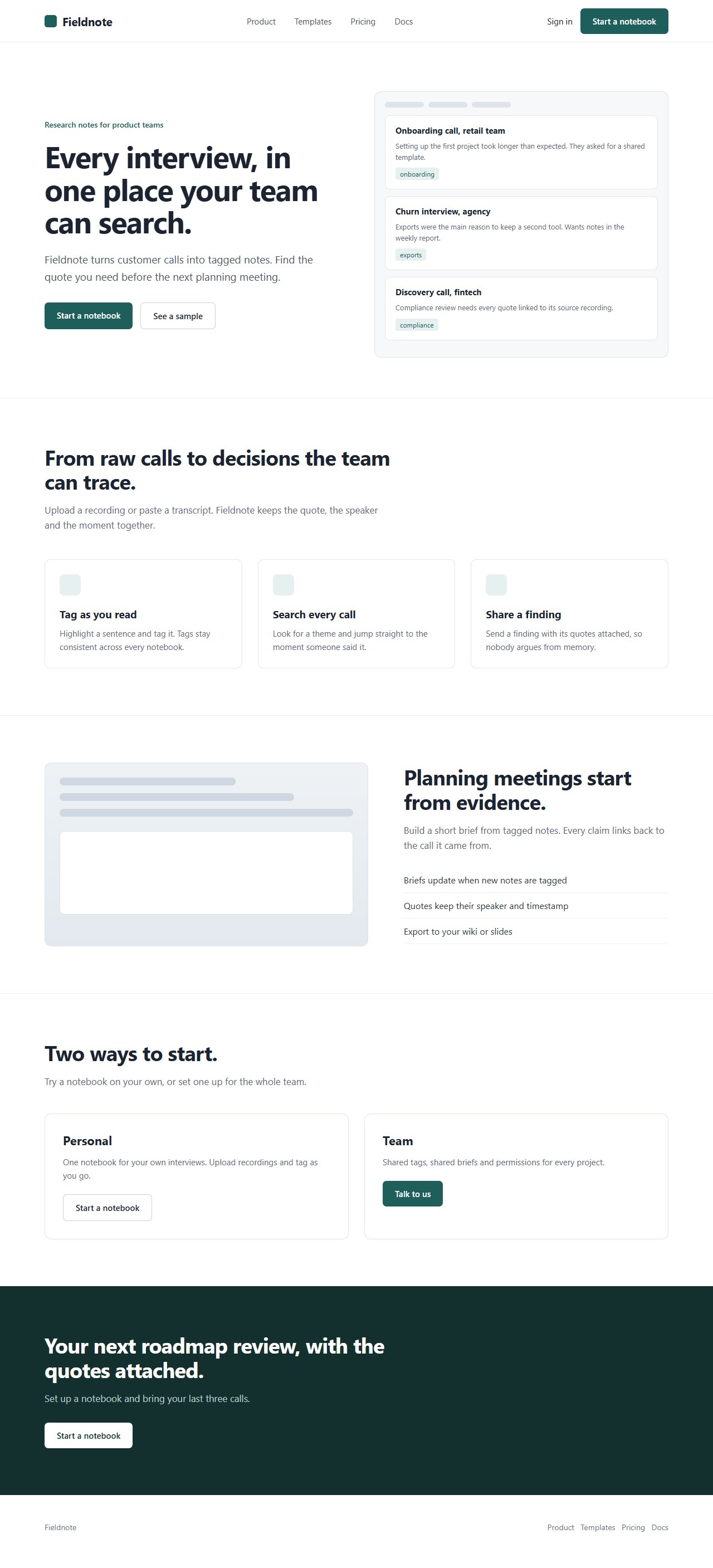
The fictional Fieldnote landing page on this site is 2,815 pixels tall at a desktop width. Its whole-page map was computed once, then the metrics were read inside a 720-pixel window at forty positions, which is what the extension shows as you scroll. Five of them are in the table. The hierarchy metric swings from 50 at the top, where the headline leads, to 1 a quarter of the way down, where three equal feature cards share the screen, and back to 32 at the closing headline.
That swing is exactly the gap the review above is looking for: a screen in the middle of the journey where nothing leads. It is not visible on a first-screen capture.
| Scroll position | Attention | Focus | Hierarchy | Coverage | Strongest cell |
|---|---|---|---|---|---|
| Top of page | 9 | 68 | 50 | 8% | Centre left |
| 25% down | 10 | 73 | 1 | 11% | Centre |
| 50% down | 9 | 71 | 8 | 10% | Centre right |
| 75% down | 6 | 57 | 20 | 6% | Centre left |
| Bottom | 8 | 72 | 32 | 9% | Centre left |
References: Provenance, hashes and metrics · Readout of all forty scroll positions
A practical review record
For each screen, write down the reader's question, the evidence offered, the next action and one potential distraction. Keep a screenshot of the original and any revision. This makes a long-page review concrete enough to discuss and repeat.
- Offer: can I understand what this is?
- Demonstration: can I see what happens when I use it?
- Fit: does it work for my situation?
- Conditions: what are the limits and data implications?
- Action: can I try it or reach the next useful page?