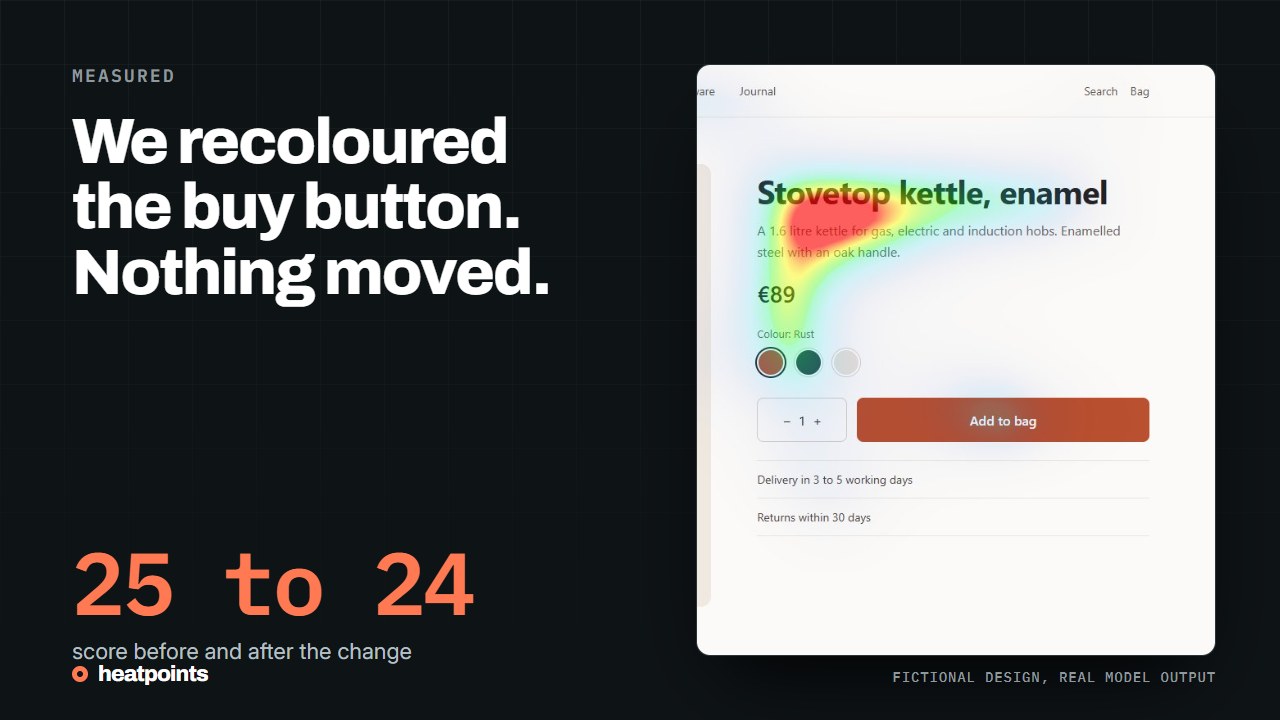
The two versions
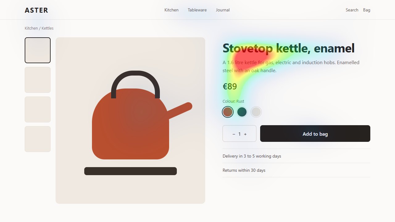
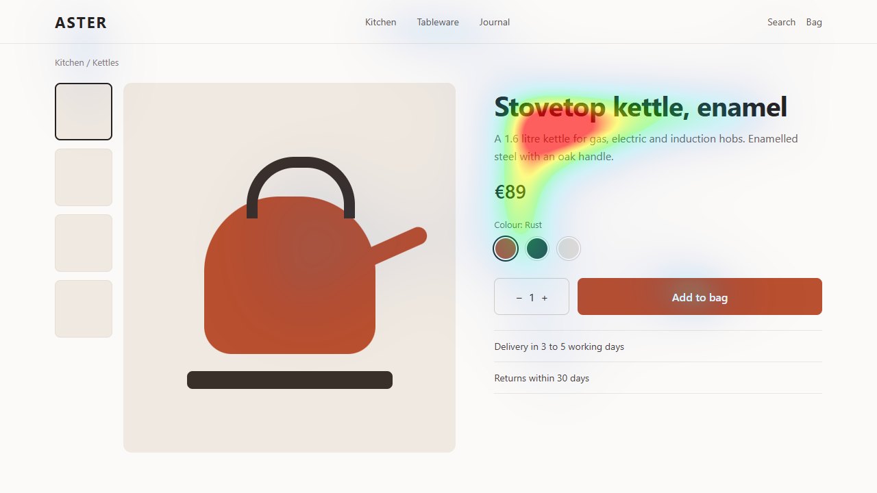
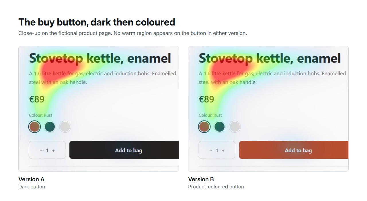
Version A is a fictional kettle product page: thumbnails on the left, a large product photo, then the title, a short description, the price, colour swatches and a dark add-to-bag button. Version B changes one thing: the button takes the product's rust colour. Everything else is identical. Both were captured at 1280 by 720 and run through UNISAL with the same settings.
References: Provenance, hashes and metrics
What the model reported
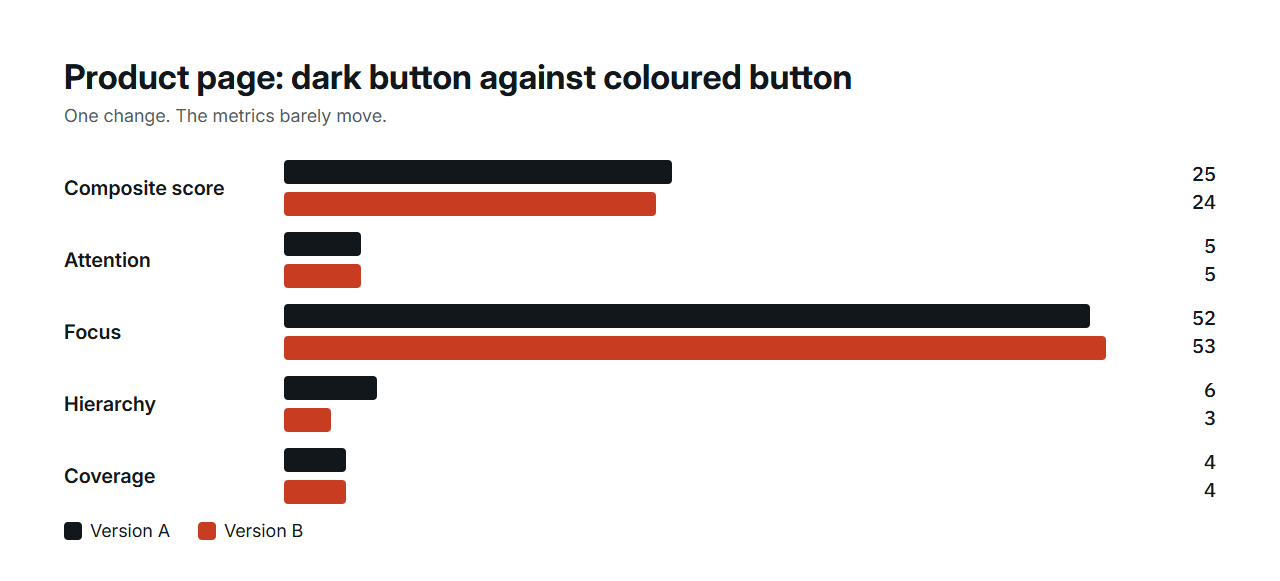
Version A scores 25 and version B 24. The dominant cell is top-centre in both, over the title and description. Attention intensity is 5 in both, focus 52 and 53, coverage 4 percent in both. The hierarchy metric moved from 6 to 3, which means the second-strongest region got slightly closer to the first, not that the button became a hotspot. In the grid, the cell holding the button moved from 2 to 3 out of 100.
In the overlay, the recoloured button shows no warm region at all. The map is nearly the same image.
| Metric | Version A, dark button | Version B, rust button |
|---|---|---|
| Composite score | 25 | 24 |
| Attention | 5 | 5 |
| Focus | 52 | 53 |
| Hierarchy | 6 | 3 |
| Coverage | 4% | 4% |
| Strongest cell | Top centre | Top centre |
Three one-change experiments side by side
This site has run the same kind of experiment on three fictional designs: a product page, a square ad and a video thumbnail. Each B version changes exactly one thing. The table puts them together, because the pattern across the three is the useful part.
Recolouring a button did almost nothing. Shrinking a headline and moving the product name and action up next to the product on the ad changed the ranking, with the action now inside a warm region. Shrinking the headline on the thumbnail raised the score from 32 to 42 because the remaining headline dominated more clearly, while the room, the thing the thumbnail was about, stayed cool. Size and position moved the maps. Colour did not.
| Design | The one change | Score A | Score B | Hierarchy A | Hierarchy B | What moved |
|---|---|---|---|---|---|---|
| Product page | Buy button in the product colour | 25 | 24 | 6 | 3 | Almost nothing |
| Square ad | Smaller headline; product name and action moved up | 56 | 49 | 87 | 78 | Action entered a warm region; score fell |
| Video thumbnail | Smaller headline, nothing else | 32 | 42 | 23 | 66 | Headline dominated more; the subject stayed cool |
References: Provenance of the ad and thumbnail experiments · The thumbnail experiment on the home page
What that means for the page
The model reads contrast, edges and text as salient. A large block of flat colour in a calm layout does not create a strong region on its own, whatever its hue. On this page, the text block carries the emphasis and the photo, a large flat shape, stays cool in both versions.
If the goal was to make the product photo more present, recolouring the button was the wrong variable. A photo with more detail, a tighter crop, or a smaller title would be the next things to try, because those are the variables that moved the maps in the other two experiments.
How to run this on your own product page
Keep one variable per comparison. Recolour, resize or move one element, then compare the maps in Championship, which shows the metrics side by side. Read where the emphasis sits before reading the score, and check that the product, the price and the action are in or near a strong region.
- Capture the first screen at a realistic width.
- State which element should lead: product, price or action.
- Change one element and export the new capture.
- Compare both maps and metrics with the same model.
- If the map did not move, you have learned something too: try the next variable.
References: Compare variants
What stays outside the prediction
Whether shoppers trust the delivery promise, understand the options or want the product cannot be read from a saliency map. A button's colour may still matter to them for reasons the model cannot see, such as consistency with the rest of the store. Once the page is live, an experiment on the real store answers what a prediction only frames.