One page, two captures
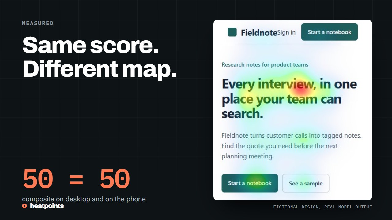
The page is the fictional Fieldnote landing page used across this site: same copy, same layout rules, rendered once at a desktop width of 1280 px and once at a phone width of 390 px where its responsive rules stack the columns. Both first screens were run through UNISAL with the same settings. Inputs, maps and metrics are published with their hashes.


References: Provenance of both renders
Same score, different story
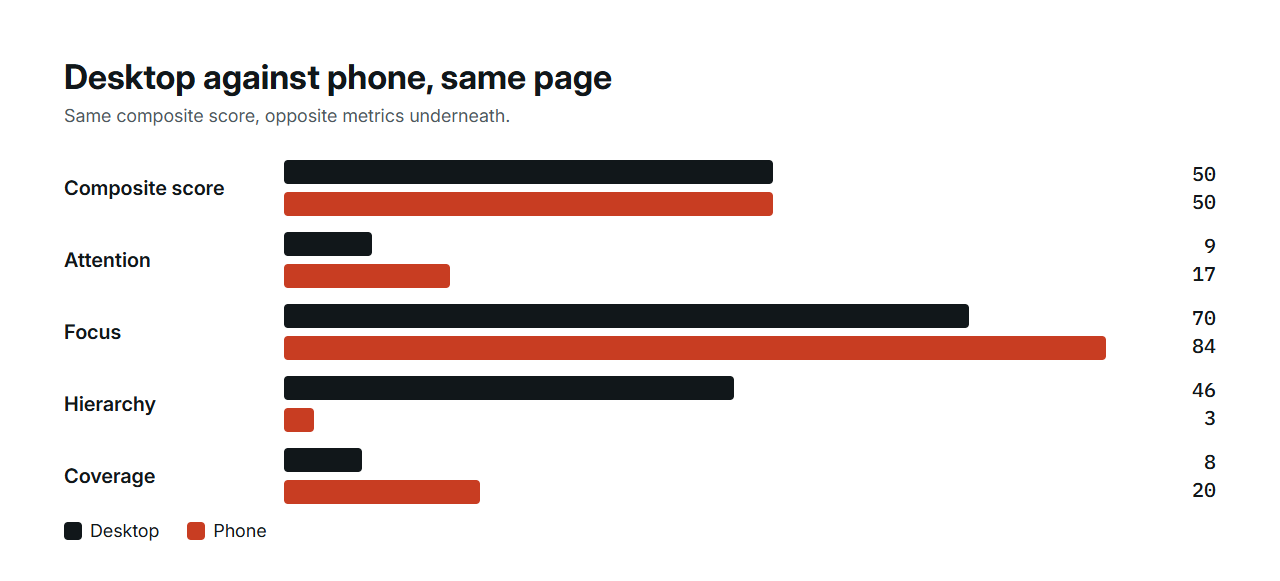
Both first screens score 50 on the composite. Everything underneath the score differs. On desktop, the headline holds the strongest region, the hierarchy metric reaches 46 and coverage is 8 percent: one clear area, little else. On the phone, the headline and the first card below it are both warm, the hierarchy metric falls to 3 and coverage more than doubles to 20 percent. Attention intensity, the mean of the map, goes from 9 to 17.
The composite landed on the same number because higher intensity and focus compensated for the collapsed hierarchy. That is a reminder that a single score summarises, it does not describe. The full-page maps tell the same story: 38 on desktop, 41 on the phone, with the phone's hierarchy at 4 against 12.
| Render | Composite | Attention | Focus | Hierarchy | Coverage | Strongest cell |
|---|---|---|---|---|---|---|
| Desktop first screen, 1280 by 720 | 50 | 9 | 70 | 46 | 8% | Centre left |
| Phone first screen, 390 by 844 | 50 | 17 | 84 | 3 | 20% | Centre |
| Desktop full page, 1280 by 2815 | 38 | 9 | 72 | 12 | 10% | Top left |
| Phone full page, 390 by 3676 | 41 | 12 | 76 | 4 | 15% | Top centre |
References: Metric definitions
What the grid shows
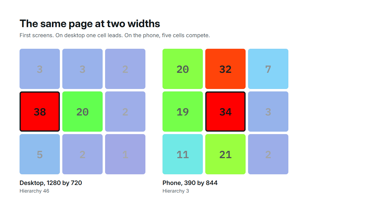
The three-by-three grid explains the hierarchy numbers. On the desktop first screen, the centre-left cell reads 38 and the centre 20; every other cell is 5 or below. One cell leads by a wide margin. On the phone first screen, five cells read between 19 and 34: the centre at 34, top-centre at 32, bottom-centre at 21, top-left at 20 and centre-left at 19. Nothing leads, so the hierarchy metric, which compares the top two cells, is close to zero.
That is what stacking does to a first screen. The headline, the subtitle, the buttons and the first content card all fit in one narrow viewport at similar visual weight, so the model finds several regions worth attention instead of one.
Why the phone map spreads
At 390 px the first screen is tall and narrow. Stacking puts the headline and the first content card in the same viewport, so two regions compete. The model also sees the text at a larger share of the frame, which raises the mean intensity, and the tighter layout leaves fewer calm areas, which raises coverage.
None of this says the phone version is worse. It says its first screen asks the reader to weigh two things instead of one, and that a decision made on the desktop capture alone would have missed it.
What to check on your own page
Run both captures, not just desktop. Compare the dominant cell on each. If the phone first screen has two competing regions, decide whether the second one earns its place above the fold or belongs further down. Keep the offer and the copy identical between the two captures so the difference comes from layout only.
- Capture at 1280 px and at the phone width your analytics shows most.
- Compare the dominant cell and the hierarchy metric, not only the score.
- Change the stacking order or the size of one element on the phone layout.
- Run the phone capture again and compare the two phone maps in Championship.
- Repeat for the second screen on the phone, which desktop visitors see in their first.
References: Compare variants
What the maps cannot say
A prediction on a static capture has no notion of thumb reach, scrolling speed or the reading order a real person follows. It flags visual competition. Whether the phone reader prefers to see the card first is a question for people, and the answer may differ by audience.