What the dataset is
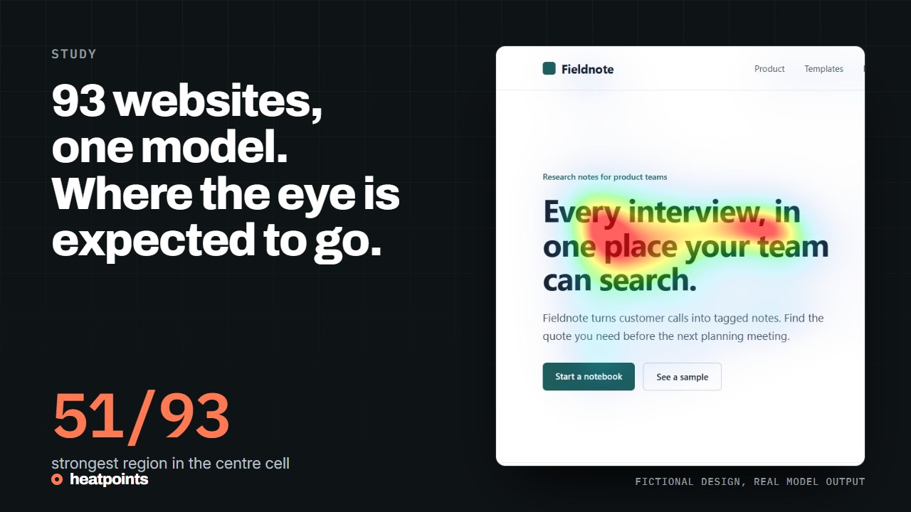
The published study contains 93 successful analyses of website captures, each summarised by the same metrics the image tool shows: normalised intensity, focus, coverage and the dominant cell of a three-by-three grid, combined into a composite score. The aggregates and per-domain scores are downloadable. The original screenshots and per-image maps are not.
These are model outputs on captures taken at one moment. They are not visitor measurements, and a capture can differ from what a visitor saw: cookie banners, lazy-loaded images and viewport size all change the pixels.
References: The 93-capture study · Download the aggregate data
Where the strongest region fell
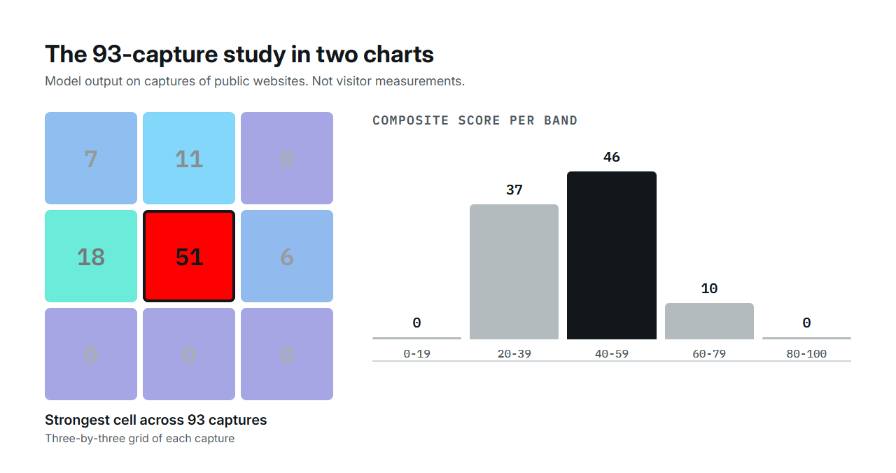
The grid divides each capture into nine cells. On 51 of the 93 captures, the dominant cell was the centre. Centre-left followed with 18, then top-centre with 11, top-left with 7 and centre-right with 6. No capture had its strongest region in the top-right cell or in the bottom row.
Put differently, in 75 of the 93 captures the strongest region was outside the top third of the image. That is a geometric observation about captured images, not evidence that the hero failed. Many captures include the browser chrome, a navigation bar or a cookie banner at the top, and a headline or product visual can legitimately sit in the centre row of a first screen.
| Dominant cell | Captures | Share |
|---|---|---|
| Centre | 51 | 55% |
| Centre left | 18 | 19% |
| Top centre | 11 | 12% |
| Top left | 7 | 8% |
| Centre right | 6 | 6% |
| Top right, bottom row | 0 | 0% |
How the scores were distributed
Thirty-seven captures scored between 20 and 39, forty-six between 40 and 59 and ten between 60 and 79. None reached 80, and none fell below 20. The median was 41 and the mean 44.1. Two thirds of the captures, 67 percent, scored below 50.
The composite rewards a clear dominant region and a strong contrast between regions. Across the set, the average hierarchy metric was 32.5 and the average coverage 10.6 percent: on a typical capture, one region led but not by much, and about a tenth of the pixels were above the intensity threshold. Busy pages spread attention and score lower. A low score is not a bad page. A store front with many products spreads attention on purpose. Read the score with the page's job in mind.
| Score band | Captures |
|---|---|
| 0 to 19 | 0 |
| 20 to 39 | 37 |
| 40 to 59 | 46 |
| 60 to 79 | 10 |
| 80 to 100 | 0 |
What a high-scoring capture tends to look like
The captures at the top of the range share a pattern that the metrics make visible: one text block or one product visual leads clearly, the rest of the first screen is calm, and the hierarchy metric is high. The captures at the bottom of the range have several elements of similar weight, a large image that competes with the headline, or a first screen filled with navigation and banners.
That pattern is consistent with what the model is: it reads contrast, edges and text. It is not a judgement on the businesses behind the captures, and a page can be commercially excellent while spreading attention across a catalogue.
What this suggests for a hero review
Check where the strongest region is before assuming it is your headline. Look for competition between the headline, the illustration and the navigation. If your product is the thing to notice, it should be in or next to a strong region. Then change one thing and compare, rather than chasing a score. The fictional demo pages on this site show what a controlled revision looks like.
- Capture the first screen at the width your visitors use.
- Locate the dominant cell and name what is under it.
- Decide whether that is the element you wanted to carry the message.
- If not, change that one relationship and run the capture again.
- Compare the two maps in Championship and read the hierarchy metric, not only the score.
References: Compare two versions · The mobile and desktop comparison
Limits of the observation
Ninety-three captures from one period is a small, historical sample with no random selection. The composite is one formula among many possible ones, and it is not calibrated against any behavioural outcome. Use the study as a reason to inspect hierarchy, not as a benchmark to beat, and do not quote the share outside the top third as a claim about visitors: it is a claim about pixels.