First identify the kind of heatmap
A click heatmap aggregates clicks from visitors. A scroll map summarises how far visitors reached. An eye-tracking heatmap aggregates gaze measurements from participants. An AI attention heatmap predicts saliency from an image. These maps can look similar while answering different questions.
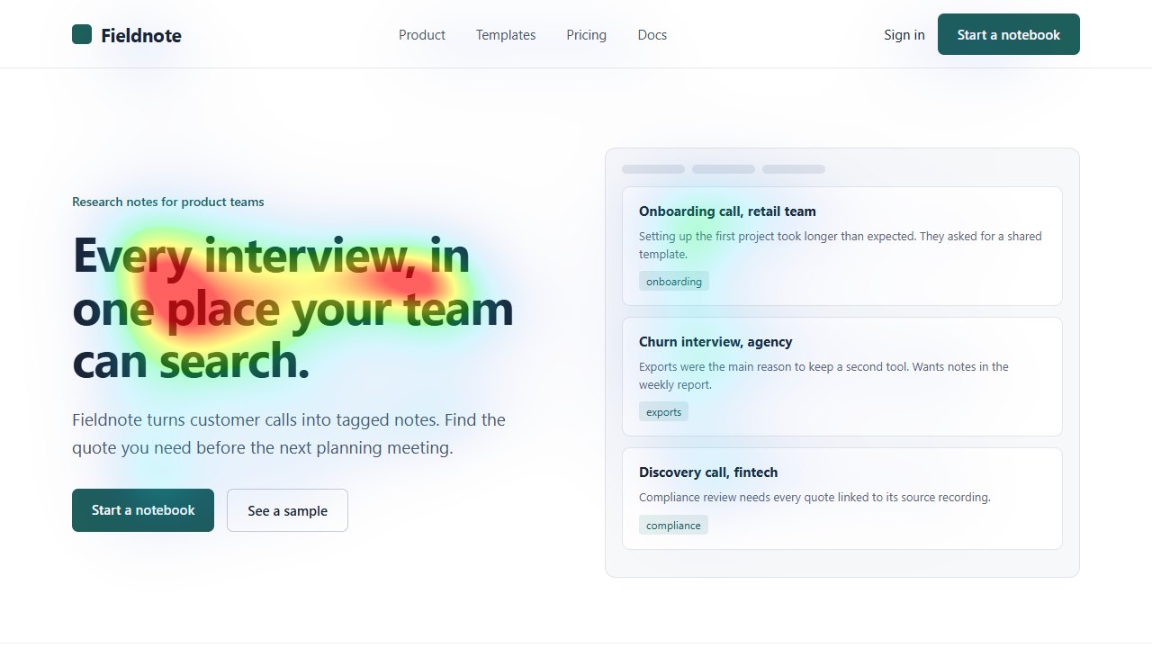
Heatpoints produces the last kind. There is no visitor sample behind your uploaded image. Its colours are relative to that image and its processing settings, so a red area is not a percentage of visitors or a measurement of time spent looking.
References: UNISAL paper and implementation
Read the map against a stated objective
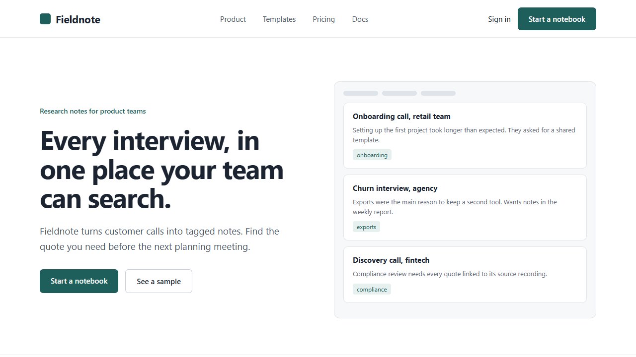
In the example below, the input is a fictional landing page and the overlay is a real model output. Decide which part should carry the message before inspecting the colours. This avoids inventing a story around whichever region happens to be warm.
- Identify the headline, product and intended action in the original.
- Locate the stronger regions in the prediction and name the elements they overlap.
- Check whether important information competes with navigation, decoration or a secondary offer.
- Return to the original image to check legibility, meaning and visual balance.
- Write one testable revision, not a general verdict that the page is good or bad.
Understand the summaries
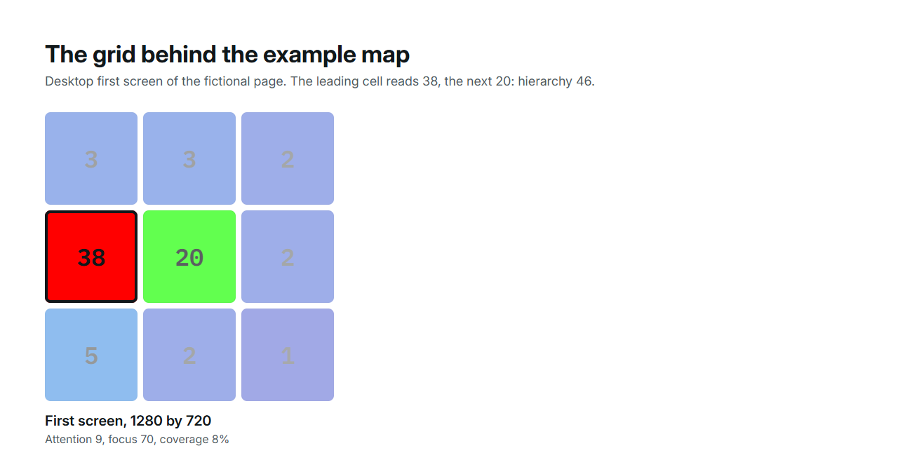
The image tool's attention value is derived from average intensity in a normalised saliency map. Coverage is the share of pixels above a threshold. Hierarchy compares average intensity across regions of a three-by-three grid. Those summaries reduce a complex image to a few numbers.
They cannot identify a button semantically or measure the probability of a click. A small change near a grid boundary can alter the dominant zone. Compare outputs from the same tool and settings, and inspect the actual overlay before interpreting a numerical difference.
References: Metric definitions and scoring
The numbers behind one map
The example above is the desktop first screen of the fictional Fieldnote page. Its metrics, from the published provenance file, show how the summaries relate to what you see: one clear region over the headline, little else, and a strong contrast between the leading grid cell and the next.
| Metric | Value | What it summarises |
|---|---|---|
| Attention | 9 | Mean intensity of the normalised map, scaled to 100 |
| Focus | 70 | How much the intensities vary; a flat map scores low |
| Hierarchy | 46 | Contrast between the strongest grid cell and the next |
| Coverage | 8% | Share of pixels above the intensity threshold |
| Strongest cell | Centre left, 38 | The next cell, centre, reads 20; every other cell 5 or below |
References: Provenance, hashes and metrics
Two maps, one change
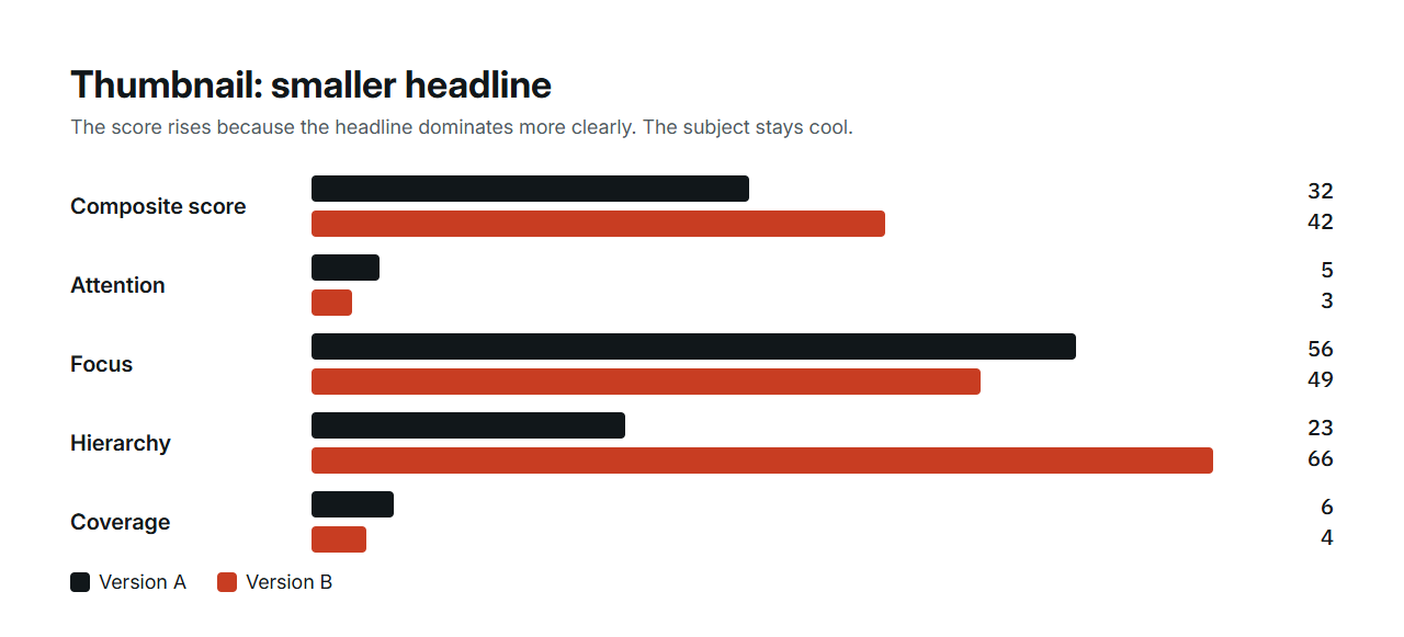
Reading a single map is the first half of the job. The second half is reading two maps of the same design after one change. On a fictional thumbnail, shrinking the headline moved the strongest cell from centre-left to top-left, raised the hierarchy metric from 23 to 66 and the score from 32 to 42. What it did not do is bring the room, the subject of the thumbnail, into a warm region. A higher score and an unmet goal can coexist, which is why the map is read before the number.
| Metric | Version A | Version B, smaller headline |
|---|---|---|
| Composite score | 32 | 42 |
| Attention | 5 | 3 |
| Focus | 56 | 49 |
| Hierarchy | 23 | 66 |
| Coverage | 6% | 4% |
| Strongest cell | Centre left | Top left |
References: Provenance of the ad and thumbnail experiments
Turn an observation into a test
For example: ‘The illustration attracts a stronger predicted region than the offer’ is an observation. ‘Reduce the illustration and preserve the offer's size’ is a revision. ‘More visitors will buy’ is a separate hypothesis that needs behavioural evidence.
Save comparable screenshots of the two versions. If the revised map supports your intended hierarchy, put the revision in front of users or measure it in a properly designed live experiment. Attention alone cannot establish comprehension or conversion.