Blog/F-Pattern vs Z-Pattern
UX Research

F-Pattern vs Z-Pattern: How Users Actually Scan Your Page

Heatpoints Lab·7 min read

Two scanning patterns dominate UX literature: the F-pattern and the Z-pattern. Designers invoke them constantly. But most get them wrong — applying the wrong pattern to the wrong page, or treating them as laws instead of tendencies.

Understanding the difference isn't academic. It changes where you put your headline, where your CTA goes, and whether users actually see the content you worked so hard to create. Here's what the research actually says — and when each pattern applies.

The F-Pattern: how text-heavy pages get scanned

The F-pattern was first documented by Jakob Nielsen and his team at Nielsen Norman Group through large-scale eye-tracking studies. They recorded how users read web pages and found a consistent shape in the gaze data: an F.

Here's how it works. Users start by scanning the first line of content horizontally — usually a headline or the opening sentence of a paragraph. Then they drop down and scan a second horizontal line, shorter than the first. Finally, they scan vertically down the left side of the page, looking for keywords, headings, or anything that catches their eye.

The result, when aggregated across many users, creates an F-shape (sometimes an E-shape) in heatmap data. It appears consistently on text-dominant layouts: blog posts, articles, search engine results pages, documentation, and news sites.

The critical insight: content on the right side of text-heavy pages often gets completely ignored. Users don't read — they scan. And they scan in a pattern that systematically skips the right half of the page after the first line or two.

"Users won't read web content thoroughly in a word-by-word manner. Exhaustive reading is rare, especially when prospective customers are conducting their initial research on a new site. Instead, users scan the page, picking out individual words and sentences."

— Jakob Nielsen, Nielsen Norman Group

The Z-Pattern: how visual pages get scanned

The Z-pattern describes a different scanning behavior — one that appears on pages with strong visual elements and minimal body text. Users scan from the top-left to top-right (the first horizontal sweep), then cut diagonally to the bottom-left, and finish by scanning from bottom-left to bottom-right.

The result is a Z-shape. On longer pages, it becomes a zigzag — a series of Z-patterns stacked vertically as the user scrolls through distinct visual sections.

This pattern appears on landing pages, marketing sites, homepages, signup flows, and dashboards — any layout where images, icons, and whitespace dominate over dense text. The Z-pattern follows the natural reading direction of Western languages (left-to-right, top-to-bottom), which is why it feels intuitive for layouts that don't demand line-by-line reading.

The key insight: in a Z-pattern layout, the diagonal is prime real estate. That's where the eye travels between the two horizontal sweeps — the perfect place for your hero image, value proposition, or the visual that connects your headline to your call-to-action.

F — TEXT-HEAVY PAGESreading mode · left edge anchorsZ — SPARSE LANDINGSscanning mode · ends on the CTA
THE TWO PATTERNS, SIDE BY SIDE — F ANCHORS ON THE LEFT EDGE OF DENSE TEXT; Z ENDS ITS SWEEP ON THE CTA. ILLUSTRATIVE.

When to design for each

The pattern isn't something you choose arbitrarily. It emerges from the type of content you're presenting. Match the wrong pattern to the wrong page and you'll fight your own users.

01

F-Pattern — Content-first pages

Blogs, documentation, news, search results. Put key information at the start of each line. Front-load your paragraphs — the first two words matter more than the last ten. Use left-aligned headings as scannable anchors so users scrolling down the left edge can find what they need.

02

Z-Pattern — Action-first pages

Landing pages, homepages, signup flows, product tours. Place your logo top-left (users look there first). Put your primary CTA top-right or bottom-right — the terminal points of each Z-sweep. Use the diagonal for your value proposition or hero visual. Keep text minimal and let visual hierarchy do the work.

03

Neither — Visually complex pages

Portfolios, galleries, complex dashboards, and tool interfaces break both patterns. Users scan based on visual weight — size, contrast, color, and motion — not reading direction. On these pages, hierarchy is everything. The biggest, brightest, most contrasting element wins attention regardless of position.

What most designers get wrong

Knowing the patterns is the easy part. Applying them correctly is where most teams stumble. Here are the mistakes we see over and over when reviewing heatmaps:

  • Forcing a pattern: Designing for the Z-pattern on a blog post, or trying to impose F-pattern structure on a landing page. The pattern should follow the content, not the other way around. If your page is mostly text, users will F-scan it no matter how cleverly you arrange the layout.

  • Ignoring mobile: Both F and Z patterns were studied primarily on desktop screens. On mobile, the narrow viewport collapses everything into a single column. Scanning becomes mostly vertical with occasional left-right sweeps. Designing for desktop scan patterns and hoping they transfer to mobile is a recipe for missed CTAs.

  • Treating patterns as laws: These are tendencies observed in aggregate across many users. Individual users deviate constantly. A high-contrast image on the right side of a text-heavy page will break the F-pattern instantly. Visual hierarchy always overrides scanning defaults.

  • Forgetting cultural context: F and Z patterns assume left-to-right reading direction. In RTL languages — Arabic, Hebrew, Urdu — these patterns mirror horizontally. Your international audience may scan your page in a completely different direction than you designed for.

79%

Of users scan rather than read on first visit

F → Z

Shifting pattern as text density decreases

2–4s

Time before a scanning pattern establishes

Beyond patterns: measuring actual attention

F-pattern and Z-pattern are useful mental models — starting frameworks that help you make reasonable layout decisions before you have data. But they're generalizations built from aggregate behavior across thousands of pages.

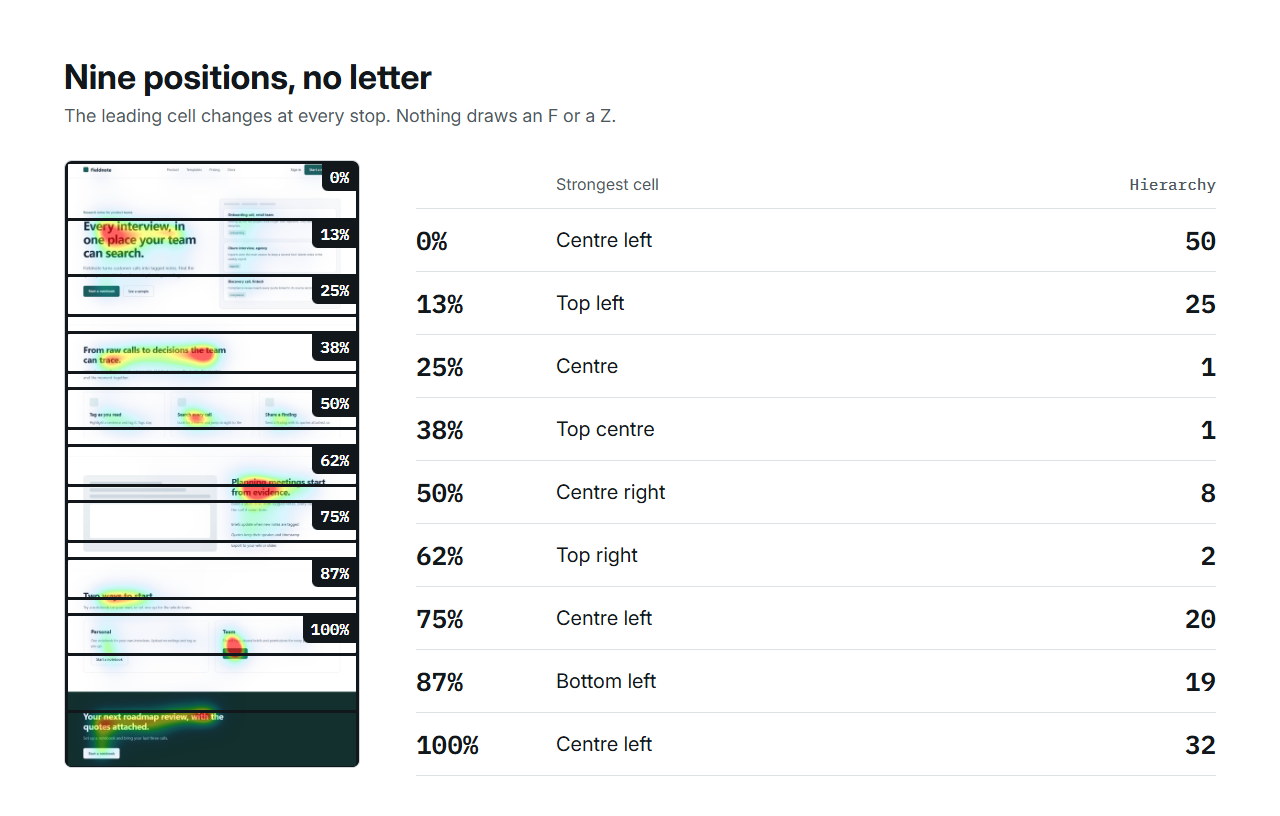
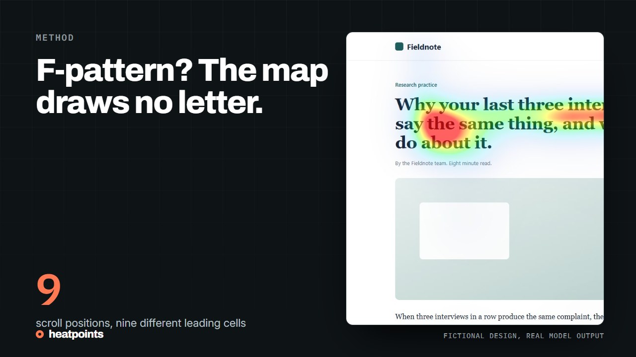
Real attention heatmap of a live page — the hot zones ignore both textbook patterns
A REAL SCAN: THIS PAGE FOLLOWS NEITHER F NOR Z — VISUAL WEIGHT WINS. UNISAL OUTPUT, DROPNIR.COM, DESKTOP.

Your specific page is different. Its unique combination of layout, typography, color palette, imagery, and content creates its own attention map. A bold pull quote might shatter the F-pattern. A full-width video might hijack the Z-pattern entirely. The only way to know how your page actually gets scanned is to test it.

This is where AI-powered heatmaps change the equation. Instead of relying on theoretical patterns, you can see the predicted attention flow for your exact design — not a generic F or Z, but the actual hot and cold zones based on your page's visual composition. Combined with an understanding of the scroll journey, you get a complete picture of how users experience your page from first glance to final scroll.

Scanning patterns tell you where to start. Heatmap data tells you where to go.

Patterns are starting points, not destinations

F-pattern and Z-pattern give you a shared vocabulary for talking about visual attention. They help you make smarter first drafts. They help you explain to stakeholders why the CTA shouldn't go in the middle of a wall of text.

But they're not laws. They're defaults — the scanning behavior that emerges when nothing on the page overrides it. Great design creates its own patterns. A high-contrast element pulls attention. A striking image breaks the F. A bold headline anchors the Z.

Learn the patterns, design with them, then verify with data. Your users don't read UX textbooks — they look where your design tells them to look.

See your actual scanning pattern

Upload any design and get a heatmap in seconds. See where attention actually goes — not where theory says it should. Free, no signup required.

Generate heatmap