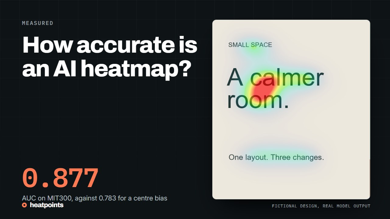
Accuracy is measured against recorded fixations
A saliency model is evaluated by comparing its map with fixations recorded from people who looked at the same images. The MIT/Tübingen Saliency Benchmark keeps those fixations private and scores every submitted model on the same images, the MIT300 set, with several metrics, because no single number captures agreement.
Those metrics are not a percentage of correct answers. AUC asks whether fixated points receive higher values than random points, so a perfect model scores 1 and a random map about 0.5. NSS reads the map's value at the fixations, in standard deviations above the map's mean. CC measures the correlation with a smoothed fixation map. KL divergence and SIM compare the two distributions, and IG, information gain, is measured relative to a centre-bias baseline. Each answers a slightly different question, which is why the leaderboard shows all of them.
References: MIT/Tübingen Saliency Benchmark
What the benchmark reports for UNISAL
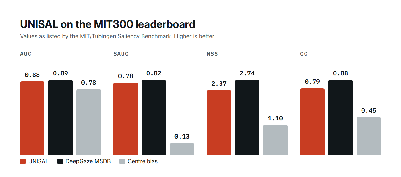
Heatpoints uses UNISAL, published at ECCV 2020. The table below copies the MIT300 leaderboard rows for UNISAL, for the best listed model, DeepGaze MSDB, and for the centre-bias baseline, which simply assumes people look at the middle of every image.
Read together, the three rows say something useful. UNISAL is far above the baseline on every metric, and below the largest research model on every metric. It gets there with a weights file of 15.4 MB, which is what lets it answer in seconds on an ordinary CPU rather than on a research server.
| Model | AUC | sAUC | NSS | CC | KL | SIM | IG |
|---|---|---|---|---|---|---|---|
| UNISAL | 0.877 | 0.784 | 2.37 | 0.785 | 0.415 | 0.675 | 0.951 |
| DeepGaze MSDB, best listed | 0.894 | 0.816 | 2.74 | 0.883 | 0.254 | 0.752 | 1.246 |
| Centre-bias baseline | 0.783 | 0.130 | 1.10 | 0.446 | 0.951 | 0.482 | 0.000 |
References: MIT/Tübingen Saliency Benchmark · UNISAL paper and implementation
How to read the gap
Two of the metrics tell the story most clearly. On shuffled AUC, which removes the advantage of predicting the centre, the baseline collapses to 0.13 while UNISAL keeps 0.78: the model finds salient regions where they are, not only in the middle. On NSS, the map's value at real fixations, UNISAL sits at 2.37 against 1.10 for the baseline and 2.74 for the best model. In plain words, when a person's eye landed somewhere on a benchmark image, UNISAL's map was usually high there, and the best research model was higher still.
The difference between UNISAL and DeepGaze MSDB is real and consistent. It is the price of a model that runs on a CPU in the browser tool, instead of a large network that needs a GPU. Whether that price matters depends on what you do with the map, which the next section is about.
What the benchmark does not measure
The benchmark images are natural photographs viewed freely by participants for a few seconds. A landing page, an ad or a thumbnail is a different kind of image, and a visitor with a task in mind is a different kind of viewer. A benchmark score tells you the model agrees well with free-viewing fixations on photographs. It does not tell you how it behaves on your interface, and no published benchmark does.
Heatpoints has not published its own benchmark on web pages. The 93-capture study on this site is a description of what the model produces on real sites, not a comparison with eye-tracking data. Treat any vendor's accuracy percentage the same way: ask which images, which viewers, which metric, and whether the number came from an independent benchmark or from the vendor's own test.
References: The 93-capture study
Which weights Heatpoints runs, and why it matters
UNISAL ships with weights trained on SALICON, a large dataset collected with mouse tracking, and a fine-tuned version on MIT1003, a smaller dataset of eye-tracking recordings. Heatpoints runs the eye-tracking version. Long pages are processed in overlapping windows instead of being squeezed into one frame, and the map is normalised by percentile so that one very bright pixel does not flatten the rest.
Those choices change the map. The same image processed by the two configurations produces visibly different overlays: the mouse-tracking weights spread more over empty space, the eye-tracking weights concentrate on text and faces. So compare results within one tool and one setting, and do not read a score from one tool against a score from another.
References: How Heatpoints processes an image
What the scores in the tool mean
The image tool reports an attention score, the mean intensity of the normalised map scaled to 100. Championship adds focus, the spread of intensities, hierarchy, the contrast between the strongest and second-strongest cells of a three-by-three grid, and coverage, the share of pixels above a threshold. None of these is a benchmark metric, and none of them is calibrated against fixations. They summarise one map so that two maps can be compared.
A concrete example from this site: on a fictional product page, recolouring the buy button moved the composite from 25 to 24 and the hierarchy metric from 6 to 3. The map itself barely changed. The metrics did what they are for: they showed that one edit made no difference, without anyone having to eyeball two overlays.
References: The product page experiment · Metric definitions
How to use a score you cannot fully trust
Use the map for what a benchmark supports: spotting which regions are likely to stand out, and checking that your intended focus is among them. Compare a revision with its original under the same settings, and read where the emphasis moved before reading the score. Then put the version you chose in front of people, because agreement with fixations on photographs is not evidence about comprehension or clicks on your page.
- Ask what should stand out before you run the image.
- Read the strongest regions and name the elements under them.
- Change one thing, run again with the same settings, compare.
- Treat a score difference as a prompt to look at the two maps, not as a result.
- Validate the version you keep with real people or a live experiment.